If you’re working on a presentation this year, it’s worth paying attention to the design trends that are starting to take over. Whether you’re building slides for a pitch, a classroom session, or a team meeting, how your presentation looks can shape how people respond to it.
From bold typography and animated layouts to minimalist templates and AI-generated visuals, design styles are changing fast. In this blog, we’ll walk you through 36 fresh trends that are not only popular but also practical. You can use them to make your slides cleaner, more engaging, and a lot more memorable. Let’s jump in.
Top 35 Presentation Design Trends
Education Presentation Design Trends
If you’re designing slides for students this year, here’s what you’ll notice becoming more common. These trends make content more approachable, engaging, and inclusive.
1. Immersive 2.5D Layers
Slides are moving beyond flat layouts. By placing icons, illustrations, and backgrounds on slightly different visual planes, your presentation gains depth without needing full 3D. This subtle lift makes topics feel more engaging and adds a layer of visual interest that keeps students focused.
2. Bold Minimalism with High-Contrast Themes
Dark backgrounds with bright, punchy text are showing up more and more. Whether it’s white text on navy or yellow on charcoal, this high-contrast style feels modern and helps students focus without distractions. Pair that with simple layouts and big, clear fonts, and you’ve got slides that are easier on the eyes and friendlier for all learners.
3. Hand-Drawn Details
There’s something comforting about slides that feel a little handmade. Whether it’s chalk-like text, doodle arrows, or rough-edged icons, these details bring warmth to the screen. Younger students especially respond well to this style. It makes the content feel less like a lecture and more like a story someone’s walking them through.
4. Interactive Choices for Students
Slides are moving beyond passive reading. You can now build presentations where students click through options, choose paths, and explore content like a choose-your-own-adventure. These branching slides help students take control of their learning and stay engaged longer.
5. Soft Gradients with a Pop of Colour
Instead of loud colours, soft gradient backgrounds are being used to create calm. Pastel blues, lavenders, or peach tones make slides feel light. Designers then add one bold accent colour like yellow or teal to highlight important information without overwhelming the eye.
6. Designed for VR or AR
With more classrooms testing immersive tech, slides are starting to reflect that shift. Visuals are spaced out and layered in ways that can be adapted for augmented or virtual reality. It prepares your content for more interactive learning in the near future.
7. Slides That Include Everyone
Accessibility is no longer a bonus. It’s the standard. You’ll see more slides with easy-to-read fonts, clear structure, and proper contrast. Students who need extra help or use assistive tools shouldn’t feel left out. And when slides are built for everyone, learning becomes smoother for the whole class.
8. Subtle Transparency and Glass Effects
You might notice slides that use soft transparencies or blurred boxes behind text. This style, sometimes called glassmorphism, helps things look modern without being overwhelming. It keeps your visuals clean, while still layering your information neatly.
9. Nature-Inspired and Eco-Minimalist Themes
Slides are going natural. You’ll see earthy colour palettes, clean layouts, and nature-inspired visuals like leaves, textures, or sky tones. These calming elements help reduce visual stress and keep the learning space peaceful and focused.
Corporate Presentation Design Trends You’ll Notice Everywhere
Whether you’re preparing for a board meeting or a strategy review, your slides this year are expected to look cleaner, sharper, and more tailored than before. Here’s what you can expect:
10. Semi-Flat with Depth (a.k.a. Flat 2.0)
Designers are finally done with ultra-flat visuals. Slides now include soft shadows, floating panels, and slight layering to bring back structure. It looks premium, without becoming too busy. Useful when you’re sharing timelines, project stages, or complex charts.
11. Dark Backgrounds with Neon Pops
This one’s eye-catching. Black, navy, or deep grey backgrounds are paired with one electric accent like neon green, electric blue, or bold orange. It works especially well for pitch decks, tech demos, or product launches.
12. Data That Moves (Animated Charts)
Forget static charts. More decks now include motion-based data like bar charts that rise as you talk or donut charts that animate section by section. This turns raw data into a visual journey, helping people see the trend, not just read it.
13. AI-Generated Visuals Replace Stock Photos
Stock photos are out. People are now using tools like Midjourney, DALL·E, or Canva’s AI to create images that fit their brand and story. Want a custom background that reflects your niche industry? Done. Want a visual metaphor that doesn’t look generic? You can make it. This gives your deck a fresh, unique edge.
Also Read: Best AI Image Generators to Elevate Your Presentations
14. Broken Grid Layouts
Slides are no longer locked into neat boxes and rows. Designers are embracing asymmetry, text overlapping images, angled sections, and visuals that break out of frames. This layout style feels dynamic, editorial, and far more premium.
15. Portrait Slide Designs for Mobile Teams
Executives and teams are checking presentations on their phones more than ever. That means traditional 16:9 decks don’t always cut it. Expect more mobile-optimised slides that are vertical, scrollable, and designed to be swiped through like an Instagram story.
Build Stunning Slides in Seconds with AI
- No design skills required
- 3 presentations/month free
- Don't need to learn a new software
Marketing Presentations Design Trends
If you’re working on a marketing deck this year, expect things to get a lot more expressive. Brands are leaning into bold design choices that feel fresh, playful, and emotionally rich. It’s less about clean and corporate, and more about standing out in the scroll. Here’s what’s trending.
16. Vivid Gradients + Colour Transitions
Big gradients are making a loud comeback. Think magenta melting into orange or cobalt sliding into lime. These sweeping transitions add energy and give your slides a modern edge. Whether you use them as backgrounds or across elements, they make everything feel more alive and exciting.
17. Big Typography as Background Element
Large text isn’t just for headlines anymore. Designers are using oversized typography as part of the visual layout. Sometimes it fades into the background, sits behind images, or becomes a transparent overlay. It adds drama and depth while still keeping the slide readable.
18. Cinemagraph Backgrounds
These aren’t full-on videos, but they bring just enough motion to catch the eye. A slow ripple in water, soft-floating particles, or light waves in the background can bring your slides to life without distracting from the content. It’s a subtle way to create mood and atmosphere.
19. Retro & Nostalgic Aesthetic
The 80s and 90s are back, but with a sleek twist. You’ll see chunky serif fonts, vintage colour palettes, pixelated edges, and layout blocks that throw it back in style. This nostalgic vibe helps brands build emotional connection and bring some storytelling flair to otherwise flat decks.
20. Custom Illustration Suites Instead of Stock
Stock images are out. More marketing teams are investing in custom illustrations that actually reflect their brand’s voice. These hand-drawn scenes or characters feel more human and help presentations stand apart from all the lookalike slides floating around.
21. Motion & Micro-Animation in Branding
A little movement goes a long way. Simple animations like bouncing icons, loading bars, or objects shifting slightly when you click through can add polish. These little touches help keep attention and subtly reinforce your brand’s personality.
Sales Presentation Design Trends
Sales decks are being redesigned to be sharper, more flexible, and emotionally engaging. These trends are helping presenters create stronger first impressions and keep audiences hooked throughout the pitch.
22. High-Contrast “Hero” Slides
You know that moment when a slide just hits? That’s what these hero slides are built for. Full-screen images with bold overlays and one strong message like “Scale Faster” or “Your Growth Partner” grab attention right from the start. They set the tone without saying too much.
23. 3D Product Visualisation & Mockups
Flat screenshots are fine, but 3D visuals bring products to life. Whether it’s a rotating gadget, a layered app interface, or a mockup that shows real-world use, these visuals help clients see your product in action. It makes a pitch feel tangible and polished.
24. Dark Mode with Bright Call-outs
Dark mode isn’t just for phones anymore. Sales decks are going dark with bold accent colours like neon green, gold, or electric blue. It gives a sleek, premium feel and makes your product visuals or call-to-actions pop. Perfect for high-stakes or luxury pitches.
25. Story-driven Visual Metaphors
Forget dry bullet points. Sales decks are using simple metaphors like mountains, ladders, rocket launches, or roadmaps to show progress, transformation, or success. When paired with visuals or icons, these metaphors make your message easier to follow and remember.
Create Presentations Easily in Google Slides and PowerPoint
14M+Installs
E-Commerce & Retail Presentation Design Trends
Retail decks are all about showing the product in its best light while connecting emotionally with the customer. The latest trends focus on clean visuals, real-world appeal, and sales-ready energy. These styles are made to grab attention fast and keep things relatable.
26. Product-First Full-Bleed Photography
These slides put the product front and centre with large, edge-to-edge images that fill the entire slide. Text is minimal or overlayed in a small corner. It helps the product speak for itself and gives a high-end catalogue feel, especially useful for fashion, beauty, or lifestyle items.
27. Split Screen “Lifestyle vs Feature” Layouts
You’ll see a growing number of slides using a clean split. One-half shows the product in use, like a person wearing it, using it, or placing it in their space. The other half highlights features, icons, or stats. This setup appeals to both the emotional side and the logical side of your audience.
28. Neon Accents on Minimal Layouts
White or light pastel backgrounds are being paired with tiny neon touches. It could be a pink circle that says “60% Off” or a bright green price tag. These accents draw attention to deals, stats, and product highlights without cluttering the layout.
29. Seasonal Visual Transformation Slides
Retail decks are changing with the seasons. You’ll spot slides that carry a Diwali theme in October or winter visuals in December. This adds a timely connection to the retail calendar and makes campaigns feel more relevant. Think snowflake icons, red-and-gold colour palettes, or festive banners.
30. Augmented Reality Preview Slides for Shopping
AR is finding its way into slide decks. You might see a mock view of how a sofa would look in someone’s living room or how a watch fits on a wrist. These slides mimic real shopping experiences, preparing your audience for a world where physical and digital stores blend together.
Startup & Tech Presentation Design Trends
Tech and startup decks are moving away from flat templates and into immersive, futuristic design. Here’s what’s shaping decks in the tech world right now.
31. Dark Mode + Neon Accents + Futuristic Fonts
This combo is everywhere. Black or deep grey backgrounds paired with bright neon blue, green, or purple highlights give off a modern, high-tech feel. Fonts are sleek and slightly angular. This style says your startup is forward-thinking without needing a single buzzword.
32. Floating 3D UI/UX Screens & Device Mockups
Instead of static screenshots, designers are now showing floating product visuals. These layouts help your audience imagine the product flow and get a feel for how it works without needing a demo.
33. AI & Automation Visual Themes
Circuits, neural network patterns, glowing lines, and abstract data shapes are being used as design elements in the background or icons. These visuals signal that your startup is tapping into machine learning, AI, or automation, even before the slide title is read.
34. Geometric Shapes & Modular Blocks
Shapes like hexagons, triangles, and connected dots are being used to explain concepts like scalability, architecture, and integrations. This layout style feels modern and is especially helpful when you’re breaking down complex systems into visual modules.
35. Immersive Interactive Slides (Non-Linear Navigation)
Startup decks are ditching the straight-line slide flow. Presenters now build decks with clickable paths or zoom effects to jump to different sections. If the investor wants to see pricing first, you go there. If they’re curious about use cases, you skip ahead. This makes the pitch feel personal, efficient, and tech-savvy.
Create Presentations Easily in Google Slides and PowerPoint
- No design skills required
- 3 presentations/month free
- Don't need to learn a new software
How to Implementation Presentation Design Trend Without Sacrificing Clarity
Step 1: Start With the Story and One Idea Per Slide
Begin by shaping your presentation around a single story. Each slide should support that story with one clear idea. This keeps your audience focused and helps them follow your message without getting lost. It also makes your slides feel lighter and easier to process. You want people to remember what you’re saying, not just what they saw.
Step 2: Choose On-Brand Templates and Typography for Consistency at Scale
Stick to templates, typography, and visual elements that reflect your brand. It keeps everything looking neat and professional, especially when more than one person is working on the same deck. When your slides feel familiar, your message comes across stronger without distractions.
Step 3: Build Accessible Color and Contrast From the Start
Good colour and contrast choices make your content easier to read. This also makes your presentation more inclusive. Avoid waiting until the last minute to fix readability issues. Use a colour contrast checker early on and make sure your slides work for everyone, including people with visual challenges.
Step 4: Structure Data for Narrative Impact (Big Numbers First)
When presenting data, lead with what matters most. Start with big numbers, key takeaways, or trends before diving into details. This helps your audience quickly grasp the point you are trying to make. It also turns raw data into a story they can connect with.
Step 5: Add Motion and Micro-Interactions Sparingly
Animations can make your slides feel dynamic, but too much can become distracting. Use transitions, hover effects, or animated elements only when they help explain something better. Keep motion purposeful and subtle so your content stays in control.
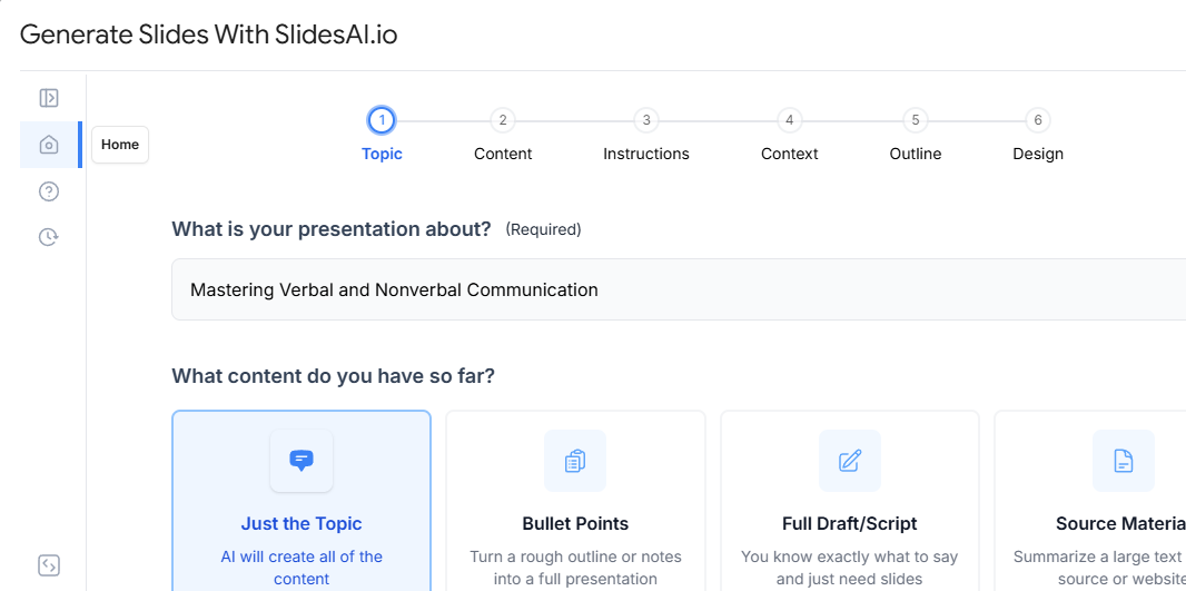
Step 6: Generate and Refine With AI, but Keep a Human in the Loop
AI tools like SlidesAI can help you build slides faster, suggest layouts, or rewrite text. But always review and tweak the output yourself. AI should support your ideas, not replace your judgment. Keeping a human in the loop makes sure the final result matches your tone, purpose, and audience needs.
Step 7: Test for Dark Mode, Mobile or Vertical View, and Projector Setups
Before presenting, check how your slides look in different settings. Test for dark mode if your audience uses it. See how the slides appear on mobile or vertical screens. Make sure everything is readable on a projector. These extra checks prevent last-minute surprises and help your message stay clear in every environment.
Make Better Slides with SlidesAI
If you’re tired of spending hours making slides look clean and well-structured, SlidesAI can make things a lot easier. Whether you’re putting together a class presentation, a business pitch, or a school project, SlidesAI helps you focus on your content while it takes care of the formatting. You type your text, and it turns it into a clear, well-designed slide deck in seconds.
What makes it better is how easily it works with different templates. You don’t need to be a designer to make slides that look polished. Below are some of the most useful SlidesAI presentation templates that you can explore:
- Border Presentation Templates: Clean edges, stylish frames. These are great when you want your slides to look sharp without doing too much. Simple and easy to customise.
- Calendar Presentation Templates: Perfect if you’re trying to organise tasks, map out schedules, or plan events. These templates make it easier for your audience to follow along and stay informed.
- Pie Chart Presentation Templates: Numbers don’t have to be boring. These templates help you present data in a way that’s visual, colourful, and easy to understand.
- Video Presentation Templates: Want to include videos? These templates are made for that. Add short clips to explain topics better, show demos, or just make your slides more engaging.
- Timeline Presentation Templates: Great for showing how something changed over time or what steps are coming next in a process. These templates bring order to your story.
- Table Presentation Templates: When you’ve got a lot of info to share, tables are the way to go. These templates help you keep things neat, structured, and easy to read.
- Agenda Templates for Presentation: Help your audience know what to expect. These templates are ideal for outlining your plan so everyone stays on track throughout the session.
Create Presentations Easily in Google Slides and PowerPoint
14M+Installs
Closing Thoughts
Presentation design trends will keep changing, but the goal stays the same. Make your message easy to follow and hard to forget. Pick a few trends that match your topic and audience, keep your slides clean, and test for readability before you present. If you want to speed up the whole process without compromising on quality, SlidesAI can help you turn your content into polished slides faster, so you spend less time formatting and more time actually preparing what you want to say.
Frequently Asked Questions Around Presentation Design Trends
Is animation necessary in presentations?
Not always. You should only use animation when it helps explain something better or shows a clear step-by-step process. Too much movement can distract your audience. Try to stick to subtle, purposeful animations that support your content instead of flashy effects that take away attention.
What makes a presentation look outdated?
If your slides still have heavy drop shadows, clipart, bevel effects, or default PowerPoint templates, they’ll probably feel old. Using too many fonts or cramming too much text on one slide also gives off an outdated vibe. To keep your presentation looking current, go for a clean layout, clear visuals, and enough white space to let your message breathe.
How often should brands update their presentation templates?
Most companies update their templates every year or two. This helps keep things in line with their latest branding and makes sure slides look good on modern screens. If you present often, you might want to make smaller tweaks more regularly based on what works best with your audience.