
Trying to explain numbers or percentages using just plain text can get confusing. Whether you’re working on a school project or a business presentation, showing data clearly is not always easy. Long lists and cluttered tables often leave people more lost than informed. That’s where a pie chart can really help. It turns numbers into a simple visual that’s easy to read and hard to miss. In PowerPoint, making a pie chart is actually pretty straightforward once you know where to start. Let’s walk through the steps together so you can turn your data into something your audience will actually understand.
What Is a Pie Chart?
A pie chart is a circular graph used to show how different parts contribute to a whole. The circle is divided into slices, and each slice represents a category. The size of each slice depends on how much it contributes to the total. This makes it easy to compare proportions at a glance and understand how data is distributed across categories.
Why Use a Pie Chart in PowerPoint?
Pie charts work really well in presentations because they turn numbers into visuals that are easy to understand. Here’s why you might want to use one in PowerPoint:
- To Show Percentage Breakdowns: A pie chart is perfect when you want to show how something is divided into parts. For example, how your budget is split between rent, food, travel, and savings.
- To Highlight Proportions Among Categories: If you’re trying to show which part takes up more space or less, a pie chart makes it instantly clear.
- To Make Data More Understandable: Numbers can get overwhelming. A pie chart breaks them down into colorful, easy-to-read sections that grab attention and make your message stick.
How to Create a Pie Chart in PowerPoint?
1. Open Your Slide
Start by opening your PowerPoint presentation. Go to the slide where you want the pie chart to appear. If you need a new slide, just click New Slide under the Home tab.
2. Insert a Pie Chart
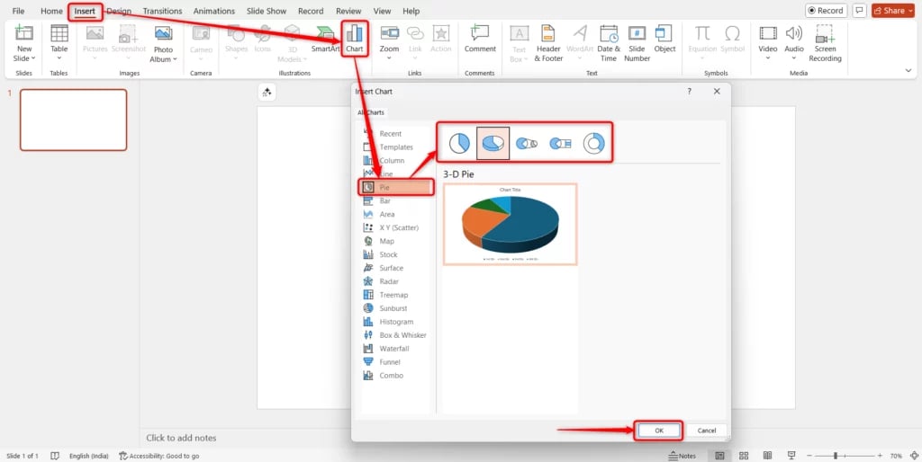
Go to the Insert tab. Under the Illustrations group, click Chart. A box will pop up. From the menu on the left, select Pie, choose either a 2-D or 3-D style, and click OK. PowerPoint will insert a sample pie chart along with a mini spreadsheet.
3. Enter Your Data
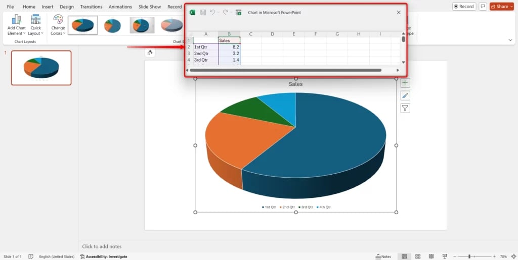
A small Excel window will appear with default values. Replace those values with your own categories and numbers. The pie chart on your slide will update automatically as you type. Once done, just close the spreadsheet.
4. Customize the Chart
Now it’s time to make the chart look the way you want. Here’s how you can do it:
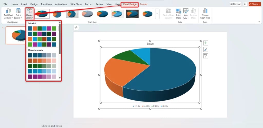
- Change Colors: Click on the chart, go to the Chart Design tab, and click Change Colors to try different color combinations.
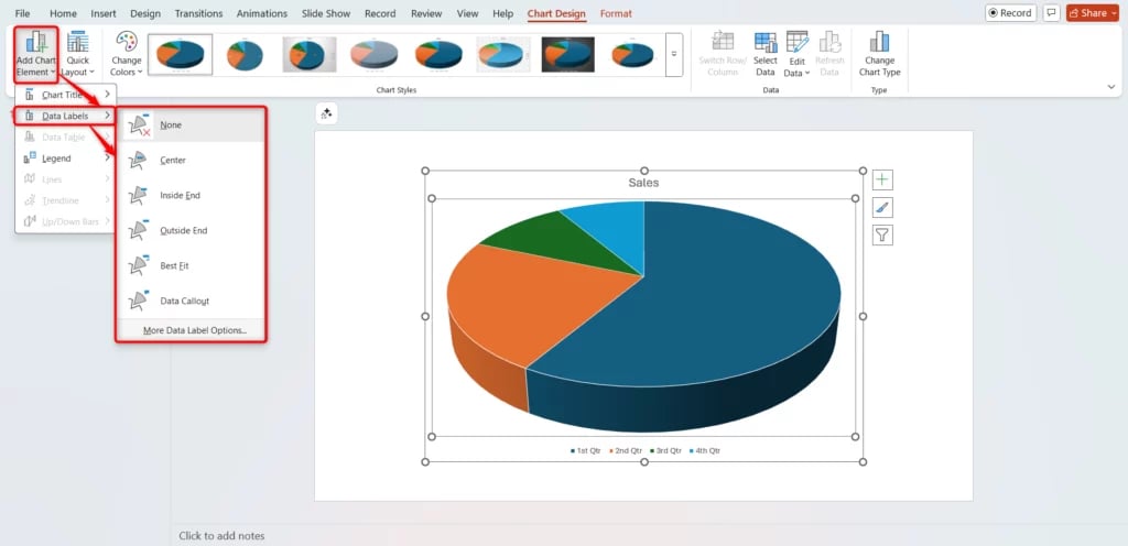
- Add Data Labels: Click the small Chart Elements icon (a plus sign) next to the chart. Tick the Data Labels box to show numbers on each slice.
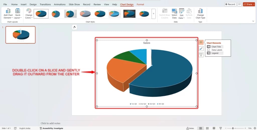
- Emphasize a Slice: Want to highlight one part? Double-click on a slice and gently drag it outward from the center.
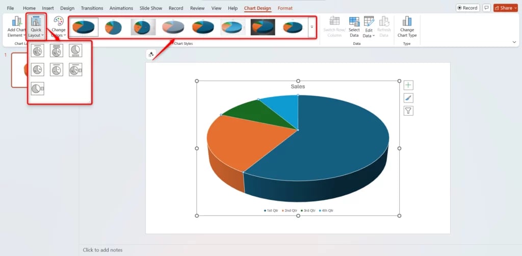
- Apply Styles: Explore Quick Layouts and Chart Styles under the Chart Design tab for a fast and polished look.
5. Resize and Reposition the Chart
Click and drag the corners to resize the chart. You can also click and drag the whole chart to place it exactly where you want it on the slide.
6. That’s It – You’re Done!
Once your chart is in place and looks the way you want, you’re all set. Your pie chart is now ready to help you present your data clearly and visually. It’s simple, clean, and makes your slide more engaging.
Pros and Cons of Using a Pie Chart in PowerPoint
Here’s a quick look at the pros and cons of using a pie chart in PowerPoint.
Pros
1. Easy to Understand
Pie charts break data into slices, so it’s easy for your audience to see how each part compares to the whole.
2. Customizable
PowerPoint makes it easy to tweak your pie chart. You can play with colors, add labels, legends, and make it match the rest of your presentation.
3. Excel Friendly
If your data is in Excel, you can pull it straight into PowerPoint. It saves time and makes updates easier, especially when you’re working with numbers that keep changing.
Cons
1. Not Great for Large Data Sets
Too many slices can make your chart look messy and hard to follow. If you have lots of categories, it might be better to pick another chart type.
2. Hard to Compare
When slices are similar in size, it’s tough to tell the difference. A bar or line chart often works better when you want to compare values closely.
3. Needs Proper Order
For your chart to make sense, the slices should be arranged in a logical order. If they’re all over the place, it might leave your audience confused.
Pro Tips for Using Pie Charts in PowerPoint
- Stick to 5 or 6 slices at most. Too many slices make the chart hard to read.
- Pick contrasting colors for slices that are next to each other. This makes each section stand out clearly.
- If the data is too detailed or complicated, go for a bar or column chart instead. Pie charts work best for simple comparisons.
- Always add percentage labels. They help your audience understand the size of each slice quickly.
Closing Thoughts
Pie charts are a simple yet helpful way to turn numbers into something people can see and understand quickly. In PowerPoint, making one doesn’t take much time, and it can make your slide look much cleaner. Just keep it clear, use only the slices you need, and don’t overcrowd it. With a few thoughtful steps, your data can speak for itself.
Create Presentations Easily in Google Slides and PowerPoint
14M+Installs

Frequently Asked Questions Related to Making a Pie Chart in PowerPoint
1. Can I copy a pie chart from Excel to PowerPoint?
Absolutely. Just make your chart in Excel, then copy and paste it into your PowerPoint slide. It will keep the formatting, and you can still edit it if needed.
2. How do I show percentages instead of values on my chart?
Click on the chart, then hit the plus icon that says Chart Elements. Go to Data Labels, click More Options, and select Percentage under Label Options.
3. Can I animate my pie chart in PowerPoint?
Yes, you can. Select your chart, head to the Animations tab, and pick an effect like “Appear,” “Fade,” or “Wipe.” Use Effect Options to decide how each slice will appear.
4. How do I change the chart title?
Just click on the current title and type in the new one. If you don’t want a title, you can simply delete it.
5. Is it possible to add more slices later?
Yes. Double-click the chart to open the data spreadsheet. Add your new data in a new row and the chart will update by itself.
6. Can I link my PowerPoint pie chart to an external Excel file?
Yes, you can. When adding your chart, use the “Paste Special” option to link it to a selected range in your Excel file. That way, updates in Excel will reflect in your chart.
7. How do I change the order of the slices in the pie chart?
The slice order follows the order of data in your Excel sheet. To change it, right-click the chart, choose “Edit Data,” and rearrange the rows in Excel.
8. Can I separate a slice of the pie?
Yes, and it’s called exploding a slice. Click once on the chart to select it, then click again on the slice you want to move. Now drag it slightly outward to separate it from the rest of the pie.
Key Takeaways
- Pie charts in PowerPoint turn numbers and percentages into clear, easy-to-read visuals that help your audience understand data at a glance.
- They work best for showing simple percentage breakdowns or proportions among a few categories, ideally 5–6 slices.
- Creating one is straightforward: insert a chart, add your data, customize colors and labels, and position it on your slide.
- Benefits include easy interpretation, customization options, and smooth integration with Excel for quick updates.
- Limitations include difficulty handling large datasets, comparing similar-sized slices, and the need for logical slice order.
- For best results, use contrasting colors, keep slices minimal, and always include percentage labels to make your chart more impactful.