
Data visualization is a helpful way to make complex statistics easier to understand. Including pie charts in presentations can make concepts clearer for your audience. In Google Slides, making pie charts is simple and doesn’t take much effort.
Here’s a step-by-step guide to creating different types of charts in Google Slides. Let’s get started!
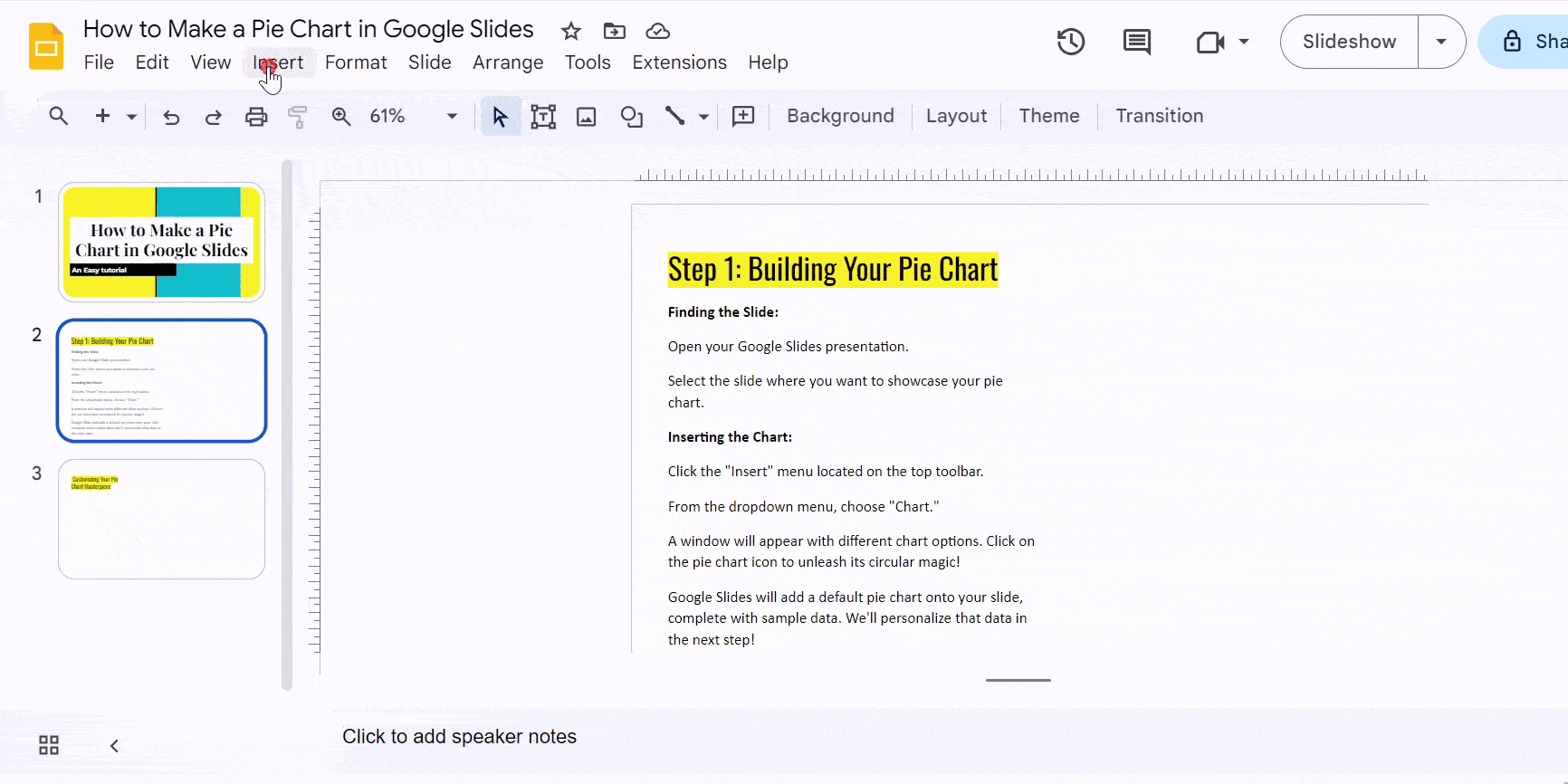
Step 1: Building Your Pie Chart
Finding the Slide:
- Open your Google Slides presentation.
- Select the slide where you want to showcase your pie chart.
Inserting the Chart:
- Click the “Insert” menu located on the top toolbar.
- From the dropdown menu, choose “Chart.”
- A window will appear with different chart options. Click on the pie chart icon to unleash its circular magic!
- Google Slides will add a default pie chart onto your slide, complete with sample data. We’ll personalize that data in the next step!
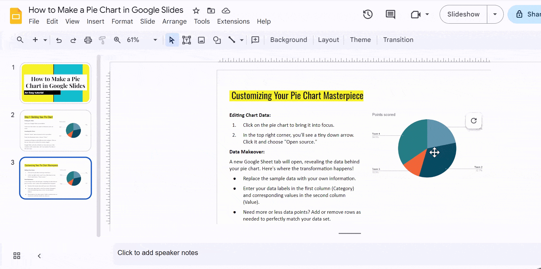
Step 2: Customizing Your Pie Chart Masterpiece
Editing Chart Data:
- Click on the pie chart to bring it into focus.
- In the top right corner, you’ll see a tiny down arrow. Click it and choose “Open source.”
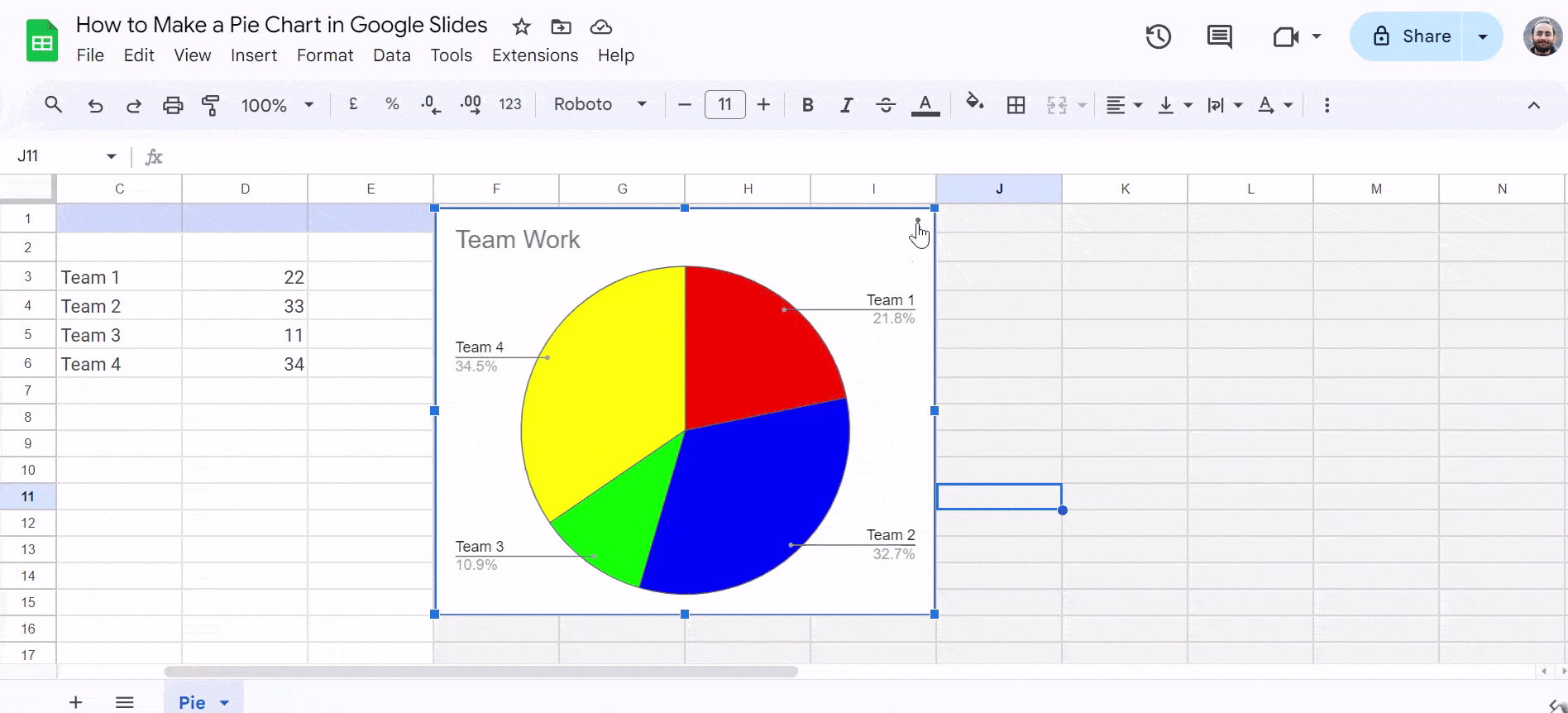
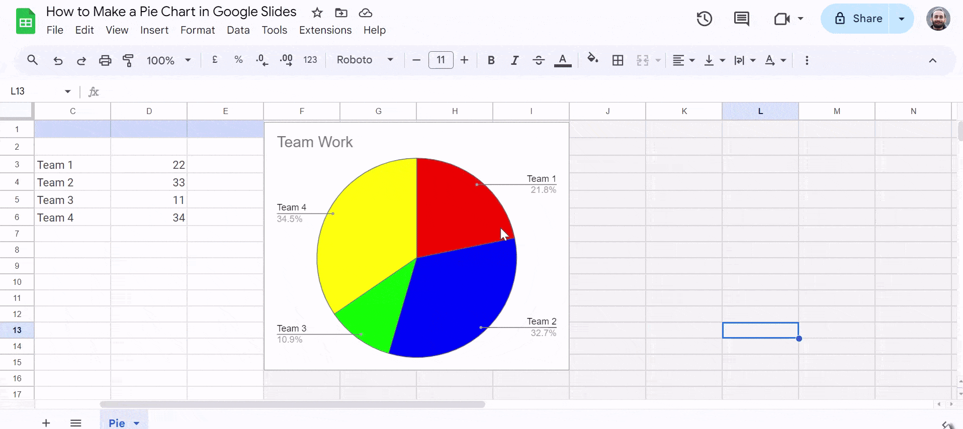
Data Makeover:
A new Google Sheet tab will open, revealing the data behind your pie chart. Here’s where the transformation happens!
- Replace the sample data with your own information.
- Enter your data labels in the first column (Category) and corresponding values in the second column (Value).
- Need more or less data points? Add or remove rows as needed to perfectly match your data set.
Closing the Spreadsheet:
Once you’ve entered your data, close the Google Sheets tab. The pie chart on your slide will automatically update, reflecting your amazing customization!
Create Presentations Easily in Google Slides and PowerPoint
14M+Installs

Formatting the Pie Chart Appearance
Want to customize the visual style of your pie chart? Google Slides offers various formatting options:
1) Select the chart: Click on the pie chart to activate the editing tools.
2) Explore the “Chart Editor” options: A sidebar will appear on the right-hand side with the “Chart Editor” options. Here you can:
- Change pie chart colors: Click on a specific pie slice and choose a new color from the color picker.
- Adjust slice order: Drag and drop the pie slices directly on the chart to rearrange their order.
- Add a donut hole: Click on the “Pie chart style” dropdown menu and choose a style with a center hole.
Bonus Tip: Play around with different color combinations to make your pie chart visually appealing and easy to interpret for your audience.
Adding Chart Titles and Labels
For additional clarity, you can add titles and labels to your pie chart:
1) Click on the chart title: By default, the chart will have a placeholder title “Chart Title.” Click on it and enter your desired title.
2) Add data labels: Click on the three vertical dots next to the chart title. Select “Chart options” and then navigate to the “Pie chart” tab. Under “Labels,” choose where you want to display your data labels (inside slices, outside slices, or both).
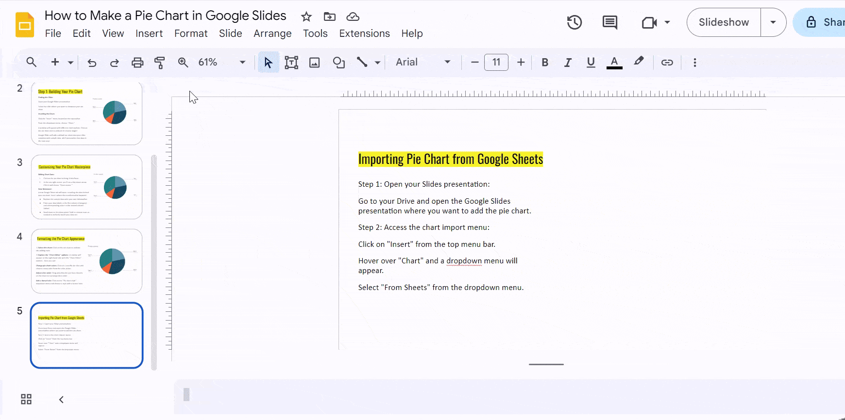
Importing Pie Chart from Google Sheets
Here’s a quick guide on how to import a pie chart you created in Google Sheets into your Google Slides presentation:
Step 1: Open your Slides presentation:
- Go to your Drive and open the Google Slides presentation where you want to add the pie chart.
Step 2: Access the chart import menu:
- Click on “Insert” from the top menu bar.
- Hover over “Chart” and a dropdown menu will appear.
- Select “From Sheets” from the dropdown menu.
Step 3: Choose the spreadsheet with your pie chart:
- A new window will pop up showing all your spreadsheets in Google Drive.
- Click on the spreadsheet that contains the pie chart you want to import.
- Click the “Select” button.
Step 4: Select the pie chart and choose a linking option:
- Another window will appear displaying all the charts within that spreadsheet.
- Click on the specific pie chart you want to import.
- Important: Make sure the “Link to spreadsheet” box is checked. This ensures any changes you make to the data in Sheets will update the chart in Slides.
- Click “Import” to finalize.
Step 5: The pie chart is now in your Slides!:
- You’ll see the pie chart inserted onto your slide.
- You can resize and reposition it using the drag handles.
Bonus Tip: To edit the pie chart data or formatting details, right-click on the chart and select “Open source.” This will open the linked Google Sheet with the chart. Make your edits and the changes will be reflected in your Slides presentation.
Download our Pie Chart Presentation Templates for your presentations!
Build Stunning Slides in Seconds with AI
- No design skills required
- 3 presentations/month free
- Don't need to learn a new software

Closing Thoughts
Creating a pie chart in Google Slides is an easy yet powerful way to show data visually. By following the steps in this guide, you can improve your presentations, making them more interesting and engaging. Clear and attractive data representation helps people understand better and remember more. Use pie charts to make your data tell a compelling story in your Google Slides presentations.
Read more:
- How to Create an Organizational Chart in Google Slides?
- How to Make a Flow Chart in Google Slides?
- How to Make a Venn Diagram on Google Slides?
- How to Make a Candlestick Chart in Google Slides?
Frequently Asked Questions
How do I access the Chart Editor in Google Slides?
To access the Chart Editor in Google Slides, simply click on your pie chart. If the Chart Editor does not appear, you can use the “Edit Chart” option.
Can I change the colors of individual slices in my pie chart?
Yes, you can customize the colors of individual slices in your pie chart. Within the Chart Editor in Google Sheets, go to the “Customize” tab, select “Pie Slice,” and adjust the colors to your liking.
Can I animate my pie chart for a more engaging presentation?
Absolutely! You can make your presentation more engaging by adding animation effects to your pie chart. Click on your pie chart, then go to the “Animate” menu, and customize the animations to enhance your presentation.