
A comparison slide in PowerPoint is one of the most persuasive tools in any presenter’s arsenal, yet most people either skip it entirely or settle for a plain two-column layout that does little to hold attention. Whether you’re a business professional making a case to stakeholders, a student contrasting research findings, or an educator breaking down complex concepts, knowing how to build an effective comparison slide in PowerPoint can be the difference between a presentation that informs and one that actually influences decisions.
In this guide, you’ll learn four practical methods to create a comparison slide in PowerPoint, from using the built-in Comparison layout to inserting tables, charts, and ready-made templates. Each method is designed to work with PowerPoint’s native features, so no advanced design skills are required. By the end, you’ll be able to present any side-by-side comparison clearly, visually, and with confidence.
What Is a Powerpoint Comparison Slide?
Comparison slides enable visually contrasting two or more elements side-by-side within a single slide. Rather than walls of text, comparisons are structured into columns to showcase data, features, and factors together.
Comparison slides allow presenters to evaluate two or more objects, concepts, solutions, etc. side-by-side within a single PowerPoint slide. They help organize similarities and differences visually through text, data, images, and other multimedia formats.
These slides are highly effective for:
- Comparing products by features to highlight competitive advantages.
- Analyzing research results through digestible side-by-side data.
- Weighing the pros and cons of solutions for clearer decision-making.
- Drawing comparisons between disparate topics to reveal relationships.
- Emphasizing differences and aligning similarities for convincing arguments.
- Adding visual variety to text-heavy slides for sustained interest.
Overall, PowerPoint comparison slides structure complex information in an easy-to-grasp format. Audiences can absorb logical comparisons at a glance. This drives home your point and influences understanding and decisions.
Build professional comparison slides faster with a free AI PowerPoint generator designed to turn your ideas into polished presentations instantly.
Types of Comparison Slides, and Uses
PowerPoint offers several types of comparison slides to help you clearly present differences, similarities, and key insights. Choosing the right type ensures your data is visually engaging and easy for your audience to understand. Below are the most effective comparison slide types along with their common uses and layout recommendations:
Pros vs. Cons Slides
Use: Highlight the strengths and weaknesses of an idea, product, or solution side by side.
Best For: Decision-making presentations, project evaluations, or comparing alternatives.
Layout Tips: Use balanced columns, bullet points, and icons to make pros and cons visually distinct. Emphasize positive points with green accents and negatives with red or neutral colors.
Before vs. After Slides
Use: Showcase transformations, improvements, or the results of a process over time.
Best For: Performance analysis, process optimization, marketing campaigns, and case studies.
Layout Tips: Display side-by-side images, charts, or infographics. Use contrasting colors to emphasize changes and improvements.
Feature A vs. Feature B Slides
Use: Compare two products, services, or options based on specific features or criteria.
Best For: Product demos, service comparisons, competitive analysis, or technical presentations.
Layout Tips: Use mirrored columns or tables. Add checkmarks, crosses, or icons to clearly indicate feature availability.
Multi-Option Comparison Slides
Use: Compare three or more options against a consistent set of criteria.
Best For: Pricing tiers, vendor evaluation, product lineups, or ranking multiple items.
Layout Tips: Use a grid or table format to maintain clarity. Avoid overcrowding each cell with text; keep information concise and scannable. Highlight the most recommended or popular option with subtle visual cues.
How to Add a Comparison Slide in Powerpoint?
There are four easy ways to design effective comparison slides in PowerPoint.
Method 1: Using SlidesAI Comparison Chart Template
While PowerPoint has its built-in comparison layouts, using online templates can offer a wider variety of styles and functionalities for your comparison slide. Here’s how to create a comparison slide in PowerPoint using SlidesAI templates:
Step 1: Go to SlidesAI → Templates
Step 2: Select “Comparison Chart Presentation Template”
Step 3: Click on the Download dropdown button and select PowerPoint
Step 4: Open the downloaded template in PowerPoint.
Step 5: Replace the placeholder text with your information. Edit the table cells, chart elements, or infographic sections to reflect your comparison points. Adjust the fonts, colors, and other design elements to match your presentation theme.
Step 6: Enhance with Images and Icons
Step 7: Proofread your content for any errors. Ensure the layout is balanced and visually appealing. Adjust the spacing and alignment of elements for better readability.
Create Presentations Easily in Google Slides and PowerPoint
14M+Installs

Method 2: Create Using Built-in Comparison Layout
The easiest way is to use PowerPoint’s pre-designed “Comparison” layout template. Here’s how to do it.
Step 1: Go to the “Home” tab and click on “New Slide”
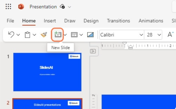
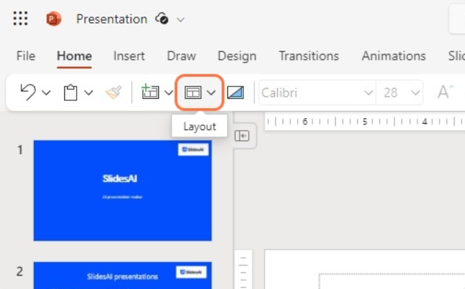
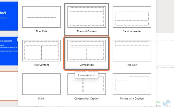
Step 2: Go to the “Layout” and select the “Comparison” template or layout from the options. The content placeholder will be split into two default columns for your data.
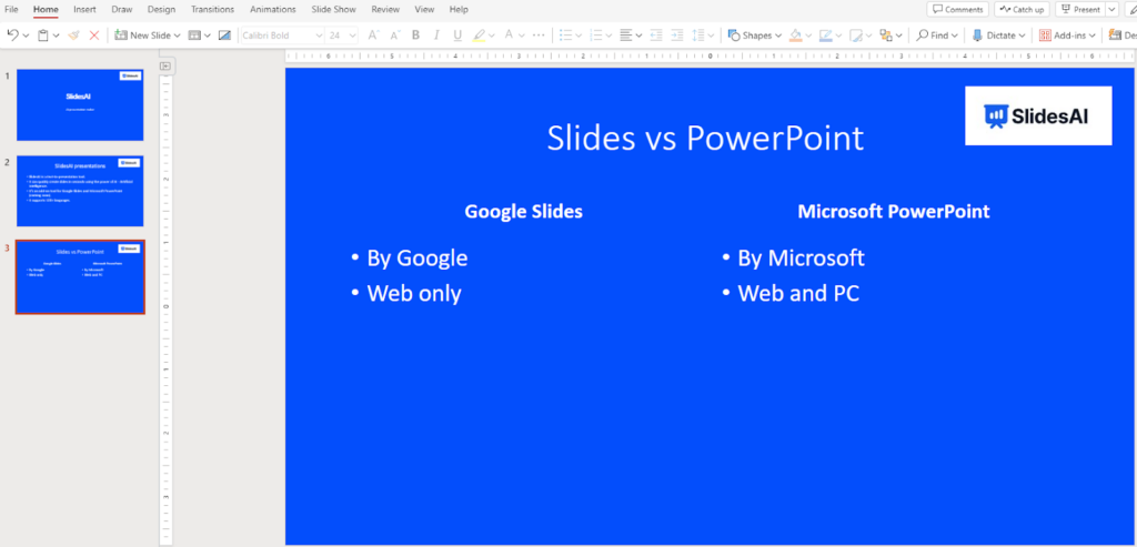
Step 3: Add and customize your desired titles, subtitles, text, images, etc. You can use a text block to add your text. Use bullet points to make your text clean. Adjust column widths if needed. You can add colors, borders, etc. for emphasis.
Method 3: How Do You Insert A Comparison Table In PPT?
Do you have some statistics and other data that you would like to present? You can insert a comparison table in PowerPoint with the desired number of columns and rows. This method works well if you have lots of detailed data to compare side-by-side.
Here’s how to add it:
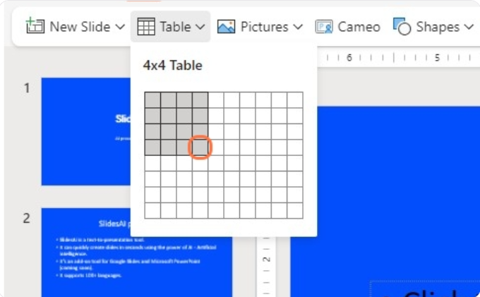
Step 1: Go to the “Insert” menu and click on “Table”.
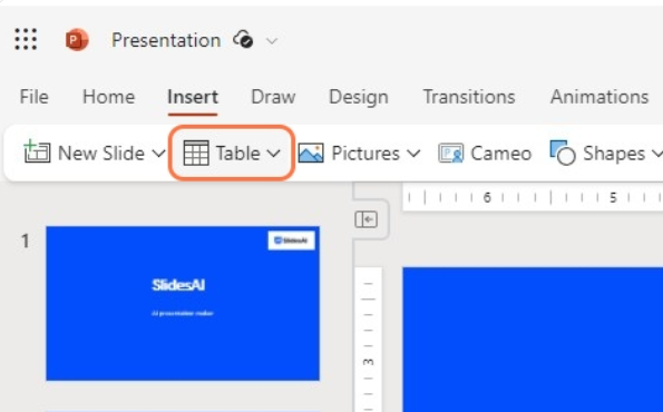
Step 2: Under “Insert Table”, pick the number of columns and rows.
Step 3: Populate the cells with your comparison data – be it text, numbers, checkmarks, or even emojis! Be creative.
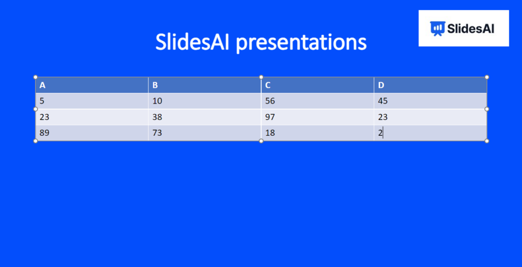
Step 4: Apply colors, borders, and shading to organize the content. You can further modify the table properties to merge cells, alter the design, include total rows or columns, apply cell borders and styles, etc.
Build Stunning Slides in Seconds with AI
- No design skills required
- 3 presentations/month free
- Don't need to learn a new software

Method 4: How to Create a Comparison Chart in PowerPoint?
Creating a comparison chart in PowerPoint is straightforward. Here’s how you can do it:
Step 1: Open PowerPoint
First, open PowerPoint by double-clicking on the icon. Start a new presentation or use an existing one.
Step 2: Insert a chart
On a new slide, go to the “Insert” tab at the top and click “Chart.” This will bring up a window with different chart options. Choose a column chart format.
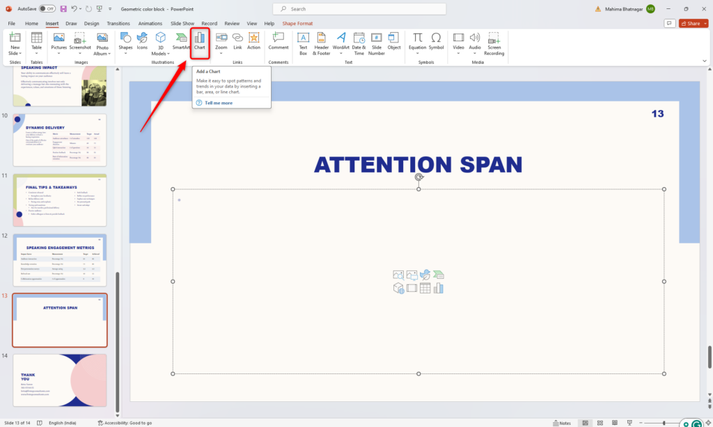
Step 3: Add your data
Once you’ve selected your chart, it’s time to input your data. PowerPoint provides a spreadsheet where you can enter and edit your data. You can also copy data from Excel and paste it into PowerPoint.
Initially, PowerPoint generates four categories with three segments each, but you can add or remove categories as needed. It’s best to stick to six categories for clarity.

Step 4: Customize the appearance
After entering your data, you can make your chart visually appealing. Click on the chart to access the formatting menu on the right side of the screen.
From there, you can adjust column width, change colors, and add design elements like shadows and borders.
That’s it! You now have a clear and engaging comparison chart ready for your presentation.
Pro Tips to Design an Effective PowerPoint Comparison Slide
Knowing how to insert a comparison slide is only half the job. How you design it determines whether your audience grasps the difference at a glance or spends the whole time squinting at the screen. These practical tips will help you create comparison slides in PowerPoint that are clear, credible, and visually compelling.
- Lead with the conclusion, not the data: Use your slide title to state the takeaway directly, such as “Plan B delivers 40% more ROI at the same cost,” rather than a generic “Plan A vs. Plan B.” Your comparison slide should support a point, not just display information.
- Limit your comparison to three columns or fewer: Two-column comparisons are the clearest; three work if one option is meant to stand out. Beyond that, the slide becomes too dense to process quickly.
- Use a highlight column to guide the decision: Apply a stronger background color, a subtle border, or a “Recommended” label to the option you want the audience to choose. It removes ambiguity and reduces cognitive load without a single extra word.
- Stick to two accent colors maximum: Use one color for positive attributes and one neutral tone for absent or negative features. More than two accent colors turns your slide into a visual scramble.
- Align row heights and column widths consistently: Use PowerPoint’s Arrange and Align tools to distribute rows evenly and snap columns to equal widths. Precise alignment keeps the audience focused on your content, not the layout.
- Use icons instead of checkmarks where possible: A shield for security, a clock for speed, a dollar sign for cost: relevant icons from PowerPoint’s built-in Icons library (Insert > Icons) communicate faster than a plain checkmark ever will.
- Apply animations selectively to build the comparison: Use the Appear animation to reveal one column at a time so you can narrate each option before the audience starts comparing. Keep it to On Click triggers and skip anything more elaborate.
- Test readability at a distance: View your slide at 50% zoom or from across the room before presenting. A minimum of 18pt font for column body text and 20pt for category labels is a reliable starting point.
What Is The Purpose Of The Comparison Slide Layout?
Here are some top reasons why incorporating comparison slides into your PowerPoint presentations can be effective:
- Simplifying complex data like statistical analyses, technical specifications, etc. into easy-to-grasp components.
- Influencing purchase decisions by using comparison to highlight competitive advantages over alternatives.
- Visualizing connections between disparate concepts or products to enhance understanding.
- Underscoring key differences between solutions through targeted side-by-side analysis.
- Holding the audience’s attention by incorporating graphical and visually engaging comparison layouts.
- Enhancing memorability as comparisons helps reinforce core points and differences.
Take Your Presentation Skills to the Next Level with SlidesAI
Creating compelling and professional PowerPoint comparison slides is crucial for driving home your main points during presentations. With these tips, you can develop beautiful and effective comparison slides that wow your audiences.
However, creating an entire visually stunning presentation doesn’t have to be difficult or time-consuming. With SlidesAI, you can instantly turn your ideas into professional, on-brand slides using AI.
SlidesAI is a revolutionary AI text-to-presentation tool that generates high-quality slides for you in just seconds. Simply add your content and let SlidesAI handle the design, formatting, and layout. You’ll get visually consistent slides tailored to your brand needs and presentation goals.
Stop spending hours building presentations. Sign up for SlidesAI today to save a huge time while creating presentation decks that leave lasting impressions. Try out the AI-powered presentation tool and take your skills to the next level!
Create Presentations Easily in Google Slides and PowerPoint
- No design skills required
- 3 presentations/month free
- Don't need to learn a new software
Frequently Asked Questions About Creating PowerPoint Comparison Slides
1. What are some best practices for making comparison slides?
Keep it concise, use visuals like icons or colors, focus on key differences, maintain consistency in design, and consider your audience’s needs.
2. How many elements can I compare on one slide?
Ideally, compare 2-3 items. More can clutter the slide and confuse viewers.
3 Can I use images or icons in my comparison?
Absolutely! Visuals can enhance understanding and add interest.
4. What are some creative ways to present a comparison?
Consider infographics, Venn diagrams, timelines, or flowcharts depending on your content.
5. Where can I find templates for comparison slides?
PowerPoint offers built-in layouts, or search online for free and paid templates.
6. How can I make my comparison slide stand out?
Use contrasting colors, and clear fonts, emphasize key points, and keep it visually appealing.