Ever felt the need to effectively showcase comparisons in your presentations? Venn diagrams, named after mathematician John Venn, offer a straightforward solution. These diagrams utilize overlapping circles to visually represent relationships between sets.
Their strength lies in simplifying complex comparisons. This makes them ideal for highlighting both commonalities and differences between concepts in your PowerPoint slides. This post will guide you through creating and incorporating Venn diagrams, helping you transform your presentations into clear and informative visuals for your audience.
What are Venn Diagrams and What are They Used For?
Venn diagrams are simple illustrations that show how two sets of things relate to each other. When circles overlap, it means they share something. If circles don’t overlap, they don’t have anything in common.
In different fields like math, logic, statistics, computer science, linguistics, and business, people use Venn diagrams a lot. You might have even seen one in your math class.
The main point of Venn diagrams is to show how different things connect with each other. They’re great for making data and facts easy to understand. That’s why they’re handy tools, especially when you’re using PowerPoint presentations.
In PowerPoint, there are lots of options for making Venn diagrams. They’re not just for numbers – they can help show relationships between different ideas or areas, making them useful for all kinds of presentations.
How to Create a Venn Diagram in PowerPoint Using 3 Different Methods?
Method 1: Generate a Venn Diagram Using SmartArt Graphics
Step 1: Open your Document and Access SmartArt:
- Launch your Microsoft Word or PowerPoint document.
- Navigate to the “Insert” tab on the ribbon menu.
- In the “Illustrations” group, locate the “SmartArt” button and click it.
Step 2: Choose a Venn Diagram Layout:
- A “Choose a SmartArt Graphic” window will appear.
- From the left pane, select the “Relationship” category.
- You’ll see various Venn diagram layouts like “Basic Venn,” “Interconnected Rings,” “Radial Venn,” and “Linear Venn.”
- Choose the layout that best suits your needs. “Basic Venn” is a good starting point for two overlapping circles.
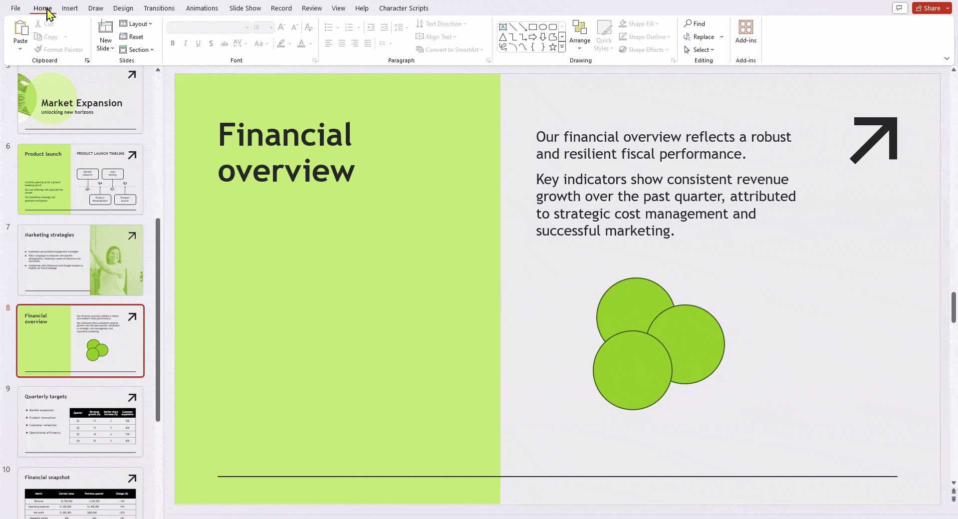
Step 3: Insert the Venn Diagram:
- Click on the chosen Venn diagram layout (e.g., “Basic Venn”).
- A preview of the diagram will appear.
- If you’re happy with the selection, click “OK” to insert it into your document.
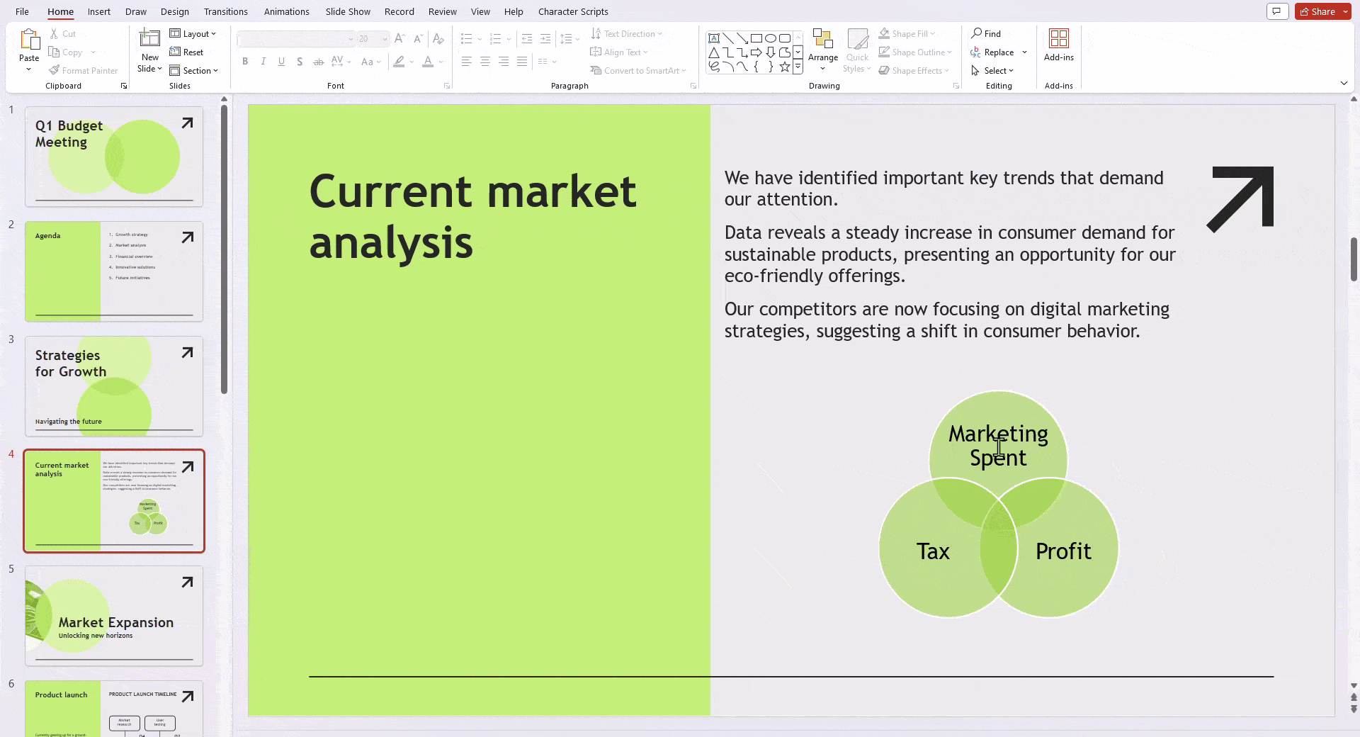
Step 4: Add Text to the Venn Diagram:
- Each circle in the diagram represents a set. You’ll need to add labels describing those sets.
- There are two ways to do this:
- Text Pane: Click on the SmartArt graphic. On the left side, you might see a “Text Pane.” Click within each text box labeled “[Text]” and type your desired label.
- Direct Editing: Alternatively, click directly on a circle within the diagram. You’ll see a text box appear. Type your label directly into the box.
Step 5: Customize the Appearance (Optional):
- SmartArt offers options to modify the visual style of your Venn diagram.
- Right-click on any circle within the diagram.
- Select “Format Shape” from the context menu.
- A menu with fill color, line style, and effect options will appear. You can customize the look of each circle and the overall diagram to your preference.
Step 6: Resize and Arrange (Optional):
- Click and drag the corners of the SmartArt graphic to resize the entire Venn diagram.
- To move individual circles, click and drag them to the desired position.
- You can also use the “Arrange” options under the “Format” tab to further align and distribute the circles within the diagram.
Create Presentations Easily in Google Slides and PowerPoint
14M+Installs
Method 2: Create a Custom Venn Diagram Using the Shape Tool
Step 1: Bring Up the Shapes Tool: Click “Insert” > “Shape” from the menu bar, then select “Shapes.”
Step 2: Craft Your Circles: Choose the “Oval” option and drag it to create your first circle. Hold “Shift” while dragging for a perfect circle.
Step 3: Duplicate and Position: Copy the circle (Ctrl/Cmd + C) and paste (Ctrl/Cmd + V) to create the overlapping circles. Arrange them strategically for your Venn diagram.
Step 4: Style and Refine: Customize each circle’s fill colors, borders, and transparency to enhance clarity and visual appeal. You can access these options through the top toolbar.
Step 5: Label It Up: Insert text boxes (“Insert” > “Text box”) and type the labels for each circle and the overlapping area (the intersection). Use clear and concise language.
Method 3: Insert a Pre-designed Venn Diagram Templates
Step 1: Go to SlidesAI and open the platform in your browser.
Step 2: Click on Free Templates from the menu, then select More Templates to browse the template library.
Step 3: Search for a Venn Diagram presentation template and select the one that fits your needs.
Step 4: On the template page, click Download and choose the option for PowerPoint.
Step 5: A template preview will open. Click Use Template in the top-right corner to open it in Google Slides.
Step 6: Once the template opens, make the necessary edits, and your Venn Diagram presentation is ready.
Build Stunning Slides in Seconds with AI
- No design skills required
- 3 presentations/month free
- Don't need to learn a new software
How to Customize the Venn Diagram in PowerPoint
There are two ways you can customize the Venn Diagram in PowerPoint:
- SmartArt (Easy):
- Insert a Venn diagram (Insert > SmartArt > Relationship).
- Edit text and format circles (right-click, Format Shape).
- Change layout (Design tab) for different overlap styles.
- Shapes (More Control):
- Draw circles (Insert > Shapes > Oval) holding Shift for symmetry.
- Format each circle individually (right-click, Format Shape).
- Overlap circles slightly and adjust fill color for the intersection area.
Also Read: How To Merge Shapes In PowerPoint
Benefits of Adding a Venn Diagram in PPT
1. Simplicity and Clarity
Venn diagrams offer a simple way to make complex information easier to understand. When you have lots of different data, it can be hard to explain how they relate using just words. Venn diagrams use circles and overlaps to show these connections visually, making it clear and easy to understand. This makes sure your audience understands quickly, especially in PowerPoint, where people might not pay attention for long. Using Venn diagrams helps keep your message clear, even when the data is complicated.
2. Increased Engagement
PowerPoint presentations can sometimes be boring with too much text and not enough visual interest. Putting Venn diagrams in your slides adds something different to look at. The way Venn diagrams show where things overlap naturally draws people’s eyes to the important parts. This keeps people interested, especially when you’re trying to explain important ideas or show comparisons. Using Venn diagrams makes your presentation more interesting and helps people remember what you said.
3. Efficient Data Comparison
Venn diagrams are really helpful when you need to compare different sets of data. Whether you’re showing how things are similar or different in markets, customer preferences, or products, Venn diagrams make it easy to see. By showing what’s the same and what’s different, it’s easier for your audience to understand the most important points. This is especially useful when you have lots of data to talk about or need to show comparisons.
4. Versatility
Venn diagrams can be used for all kinds of different topics and ideas. They’re not just for one type of thing. You can use them for lots of different subjects, from math to business to science. Because they can be used in so many different ways, they’re a really useful tool no matter what you’re talking about.
5. Professional Presentation
Putting well-designed Venn diagrams in your PowerPoint slides shows that you care about how your presentation looks. It shows that you’ve taken the time to make things clear and organized. This makes you look more professional and makes your presentation better. In a business or school setting, looking professional is really important. Using Venn diagrams not only makes your information easier to understand but also makes your slides look better overall.
Closing Thoughts
Creating Venn diagrams in PowerPoint is a straightforward process that can significantly enhance your presentations. These diagrams offer a visually appealing way to represent comparisons and connections, leading to a clearer understanding of your message by the audience. By following the steps mentioned above, you can easily add Venn Diagrams and take your presentations to the next level.
Create Presentations Easily in Google Slides and PowerPoint
- No design skills required
- 3 presentations/month free
- Don't need to learn a new software
Frequently Asked Questions About Creating a Venn Diagram in PowerPoint
1. How do I combine overlapping circles to depict the common ground in a Venn diagram?
Select the circles you want to group. Right-click and choose “Group” from the menu to create a single shape representing the overlapping area.
2. How can I design a circle divided into three distinct sections for a Venn diagram?
While PowerPoint doesn’t directly split shapes, you can achieve this using a pie chart:
- Insert a Pie Chart with three data points (dummy values are acceptable).
- Format the chart: remove borders, adjust slice colors for your sections, and delete data labels for a clean look.
3. What do the different elements of a Venn diagram signify?
Venn diagrams utilize circles (and sometimes a rectangle) to visually represent sets and their connections:
- Circles: Each circle symbolizes a set of items, typically labeled with its name within.
- Overlapping Area (Intersection): The overlapping region represents elements belonging to both sets.
- Non-Overlapping Areas: These areas depict elements unique to each set and can be labeled with descriptions.
- Universal Set (Optional): A surrounding rectangle includes everything relevant to the diagram, even elements not included within the circles.