
Graphs bring numbers to life. Instead of overwhelming your audience with rows of data, a clean, well-designed graph in Google Slides can instantly show patterns, comparisons, and trends.
Whether preparing a classroom presentation or pitching business results, adding a graph helps you tell a clearer, smarter story.
In this guide, we’ll show you how to make a graph on Google Slides easily.
Why Use Graphs in Google Slides Presentations?
Graphs are one of the most effective ways to communicate data clearly and quickly. In Google Slides, charts help turn complex numbers into visual insights that are easier for audiences to understand and remember.
Using graphs in your presentation can help you:
- Highlight trends and patterns at a glance
- Compare values across categories clearly
- Support your message with data-driven visuals
- Keep your slides clean and engaging instead of text-heavy
Whether you’re presenting business metrics, academic research, or marketing results, well-designed graphs make your story more persuasive and professional.
What Types of Graphs Can You Instantly Add in Google Slides?
Google Slides offers a broad range of charting choices to meet various presentation requirements. The different kinds of charts you can make are listed below:
- Bar Chart
- Column Chart
- Line Chart
- Pie Chart
- Doughnut Chart
- Area Chart
- Scatter Chart
- Bubble Chart
- Radar Chart
- Stock Chart
- Surface Chart
- Treemap Chart
- Sunburst Chart
- Histogram Chart
- Waterfall Chart
- Funnel Chart
Below are some common types of graphs you can instantly add to Google Slides:
Types of Graphs You Can Use
Not all graphs are created equal, and depending on what you’re trying to show, one type might work better than another. Here’s a quick look at the main ones you’ll find in Google Slides:
- Bar Graph
These are best for comparing values across different categories. Super handy when you want to show things like survey results, sales numbers, or performance stats. - Line Graph
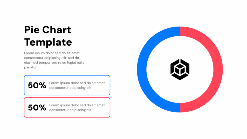
These are great for showing trends over time. If you’re tracking growth, changes month by month, or progress over a period, this one’s an excellent choice. - Pie Chart
Pie charts are perfect for showing how something breaks down into parts. If you are talking about budgets, percentages, or how a whole is split into different sections, these are great - Column Chart
Column charts are similar to bar graphs but with vertical bars. They’re great when you want to compare groups or track changes across time in a slightly different layout.
Want to dive deeper into pie charts? Here’s a blog that walks you through it.
How to Create a Graph on Google Slides?
Making a graph in Google Slides is easier than it looks. Just follow these simple steps and you’ll have a clean, professional-looking chart ready to go in minutes.
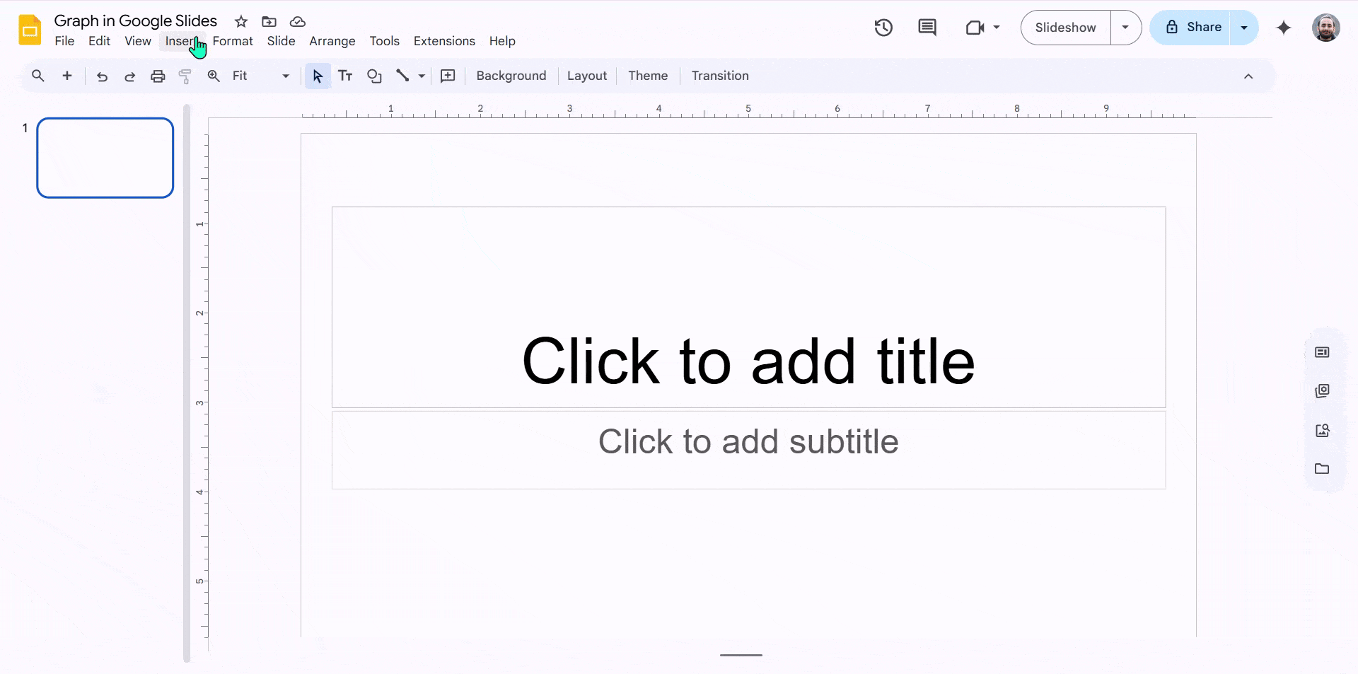
Step 1: Open Google Slides
Start by opening your presentation or creating a new one in Google Slides. Choose the slide where you want to add the graph.
Step 2: Insert a Chart
Click on “Insert” in the top menu, then hover over “Chart.” You’ll see options like Bar, Column, Line, and Pie. Pick the type of graph that fits your data.
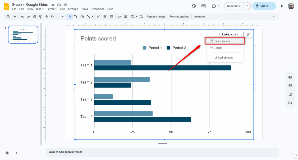
Step 3: Access Google Sheets
Once the chart appears on your slide, click on the drop-down arrow in the top-right corner of the chart and select “Open source.” This will take you to the Google Sheets file linked to your chart.
Step 4: Enter Your Data in Google Sheets
In the sheet that opens, replace the placeholder numbers with your own data. As you type, you’ll see the graph update automatically in real time.
Step 5: Customize the Graph
Want to change colors, fonts, or layout? You can do all that from the Chart Editor in Google Sheets. Click the three dots on the chart and select “Edit chart” to start customizing.
Step 6: Add Titles and Labels
Clear titles and axis labels help your audience understand your data. In the Chart Editor under the Customize tab, you can add or edit titles, legends, and labels.
Step 7: Final Adjustments
Once everything looks good, close the Google Sheets tab. Your chart will automatically update in Google Slides. You can also resize or move the chart on your slide as needed.
Step 8: Present Your Slides
That’s it! Your graph is ready to go, and you’re all set to present.
Download SlidesAI’s free template for graphs and charts and skip the formatting hassle!
Graphs aren’t just about numbers, they’re about giving clarity, creating an impact, and storytelling. With Google Slides and a few simple steps, you can turn raw data into visuals that explain better than words.
Whether it’s a bar chart for sales figures or a pie chart for budget breakdowns, the right graph helps your audience connect with your message instantly.
And if you’re short on time or want beautifully designed slides without the extra effort, SlidesAI has you covered.
Use our smart templates to create professional, data-driven presentations in minutes with a graph on Google Slides, so you can focus on what really matters: delivering your story with confidence.
Also read other helpful guides below:
- How to Make a Flow Chart in Google Slides?
- How to Make a Pie Chart in Google Slides?
- How to Create a Candlestick Chart in Google Slides?
- How to Make a Venn Diagram on Google Slides?
- How to Make a Graph in PowerPoint?
Common Graph Issues in Google Slides (And How to Fix Them)
Graph not updating?
Make sure you click the “Update” button on the chart in Google Slides after editing data in Google Sheets.
Wrong data showing?
Check the selected data range in the Chart Editor and confirm it matches your spreadsheet values.
Chart formatting looks off?
Edit the chart directly in Google Sheets rather than resizing it excessively in Slides.
Can’t edit the chart?
You may not have permission to access the linked Google Sheets file. Request edit access or make a copy.
Frequently Asked Questions for Graphs in Google Slides
Why does my graph appear blurry or pixelated?
Blurriness usually happens when you insert a screenshot or image of a graph instead of using Google Slides’ built-in chart feature. To keep your graphs, crisp and clear, always insert charts directly through the slide’s chart tool.
Will my graph stay intact if I download the presentation as a PowerPoint or PDF?
Yes, your graph will be visible in those formats. However, you won’t be able to edit the graph unless you open the original Google Slides file and update the linked Google Sheets data.
Can I add animations to graphs in Google Slides?
Definitely! You can animate the whole chart or specific parts, like bars or lines, using the animation options in Google Slides to make your presentation more engaging.
Is it possible to add more than one graph on a single slide?
Yes, you can add multiple graphs on the same slide and adjust their size and position to suit your layout perfectly.
How can I change the colors and labels of my graph?
To customize colors, fonts, axis labels, or legends, just edit the chart in the linked Google Sheets. Your graph in Google Slides will update automatically with those changes.