Ever felt stuck presenting qualitative data in your presentations? While quantitative data might be easier to showcase with charts and graphs, qualitative information like satisfaction levels or underlying reasons can be trickier. This is where Harvey balls come in! These simple visuals can help you present qualitative data in a clear and easy-to-understand way.
This blog post will show you how to create Harvey balls for your PowerPoint presentations. We’ll walk you through the steps and explain the benefits at the end, so you’ll have a complete understanding of how they can improve your presentations. Let’s get started!
What is Harvey Ball?
Harvey balls are a simple visual tool used to show qualitative information, like ratings, in documents, reports, and presentations. They consist of circles that are typically filled in with different shades or colors. The amount of shading or color represents things like completion, satisfaction, importance, or any other quality that can’t be easily measured with numbers.
They’re quite flexible. You can adjust the size of the circles or the amount of shading to create the effect you need. Generally, a full circle means something is high (like full completion or high satisfaction), while an empty circle means something is low (like incomplete or not very good).
Harvey balls are often used to compare things. For example, you might use them to compare products by price, weight, quality, taste, safety, and so on. Now that you know what Harvey balls are, let’s take a look at their advantages.
How to Create Harvey Balls in PowerPoint?
Ready to visually represent progress or performance with Harvey Balls? Here’s how to create them in PowerPoint:
Method 1: Using SlidesAI’s Pre-designed Template
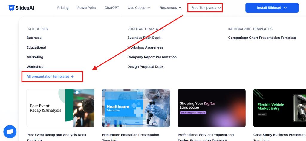
Step 1: Open SlidesAI. Go to Free templates and select “All Presentation Templates.”
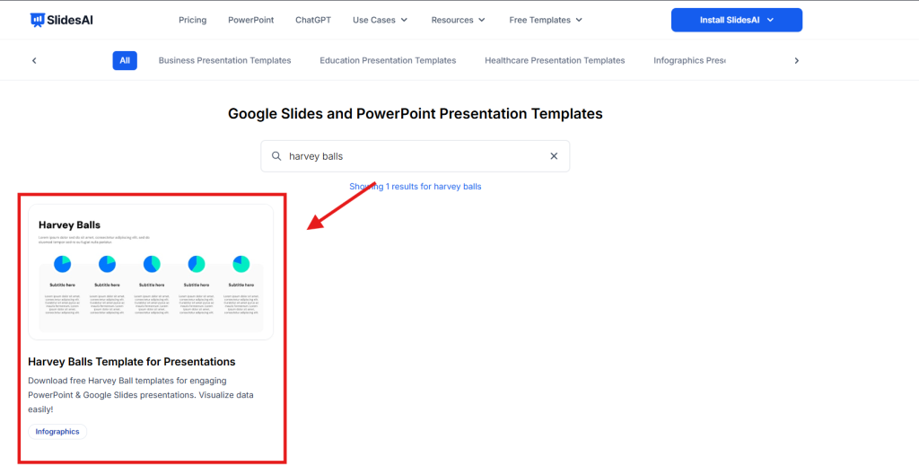
Step 2: Search for “Harvey Balls template” and open it.
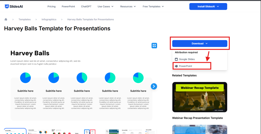
Step 3: Once the template page is open, on the right side, click on “Download” dropdown and download it for PowerPoint.
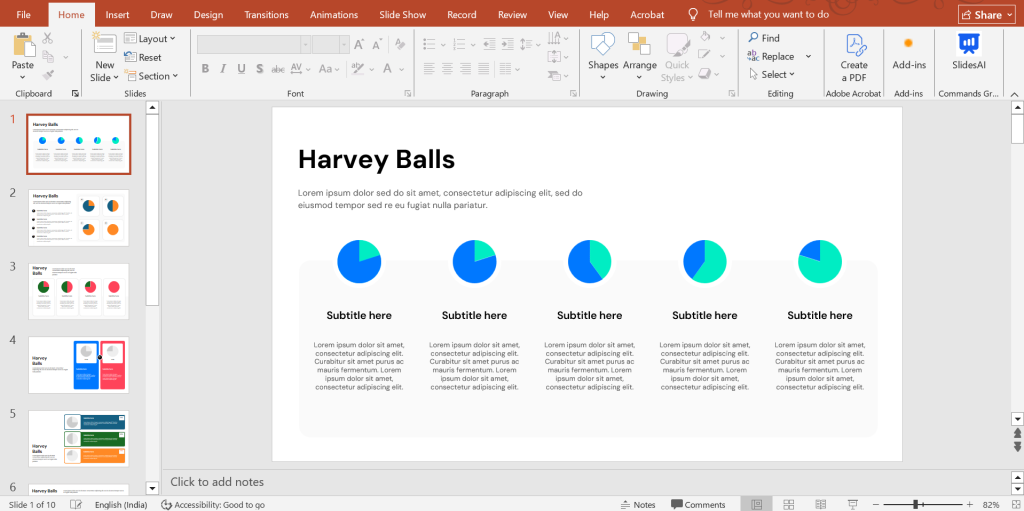
Step 4: Open the downloaded Harvey Balls template in PowerPoint. Make the necessary edits, and your Harvey Balls slide will be ready.
Method 2: Creating Manually
Step – 1. Base Circle: First, click the “Insert” tab and then the “Shapes” dropdown menu. Choose “Oval” from the “Basic Shapes” section. Hold down the “Shift” key while dragging to create a perfect circle. You can adjust its size using the corner handles.
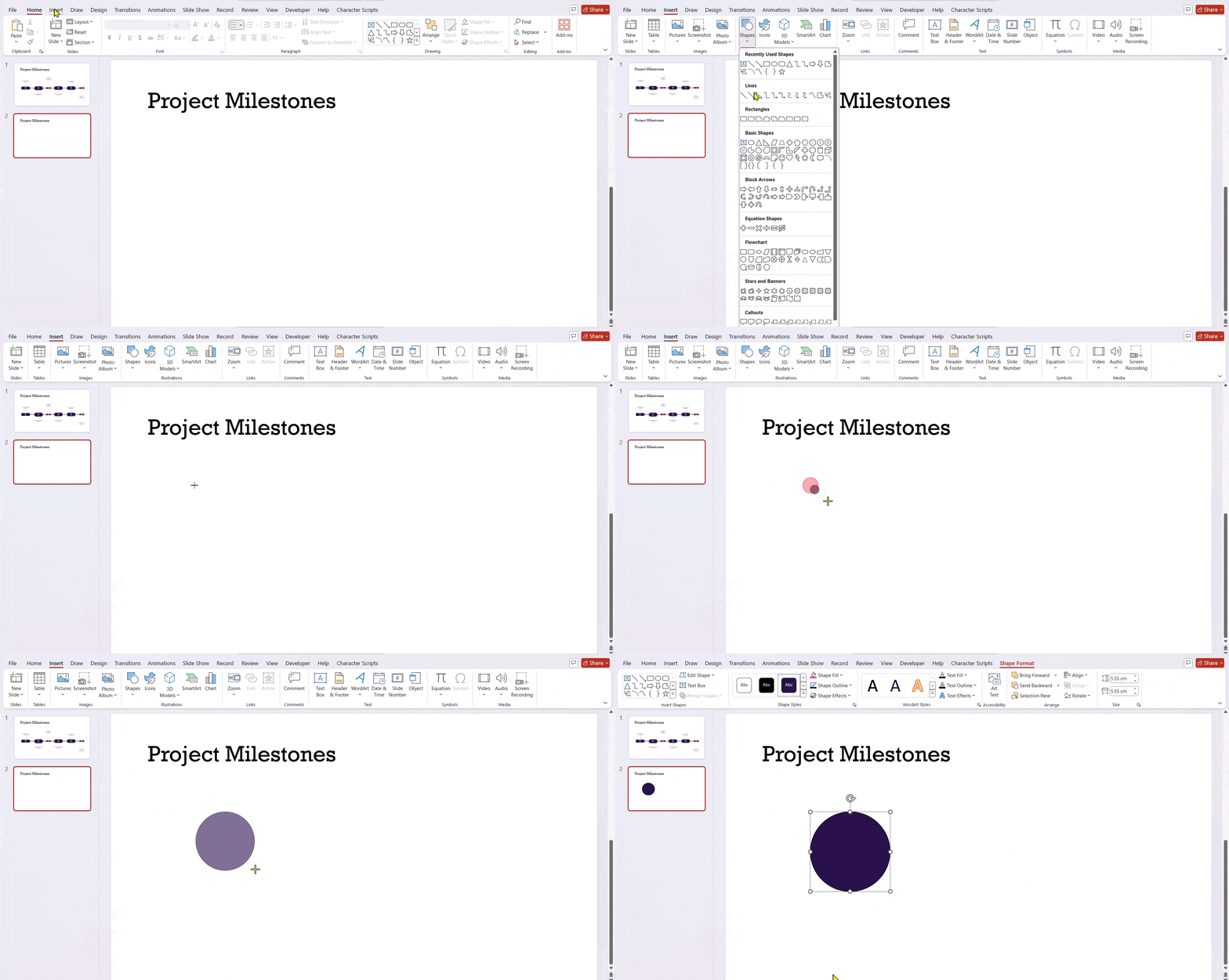
Step – 2. Format (Optional): If you’d like to customize the look, right-click the circle and choose “Format Shape.” This lets you change the color for a solid Harvey Ball, try out gradients for a more interesting look, or adjust the outline.
Step – 3. Filled Segment: Go back to the “Insert” tab and “Shapes” again. This time, choose “Partial Circle.” Hold down “Shift” while drawing it on top of your circle. Resize and move it around until it fits perfectly.
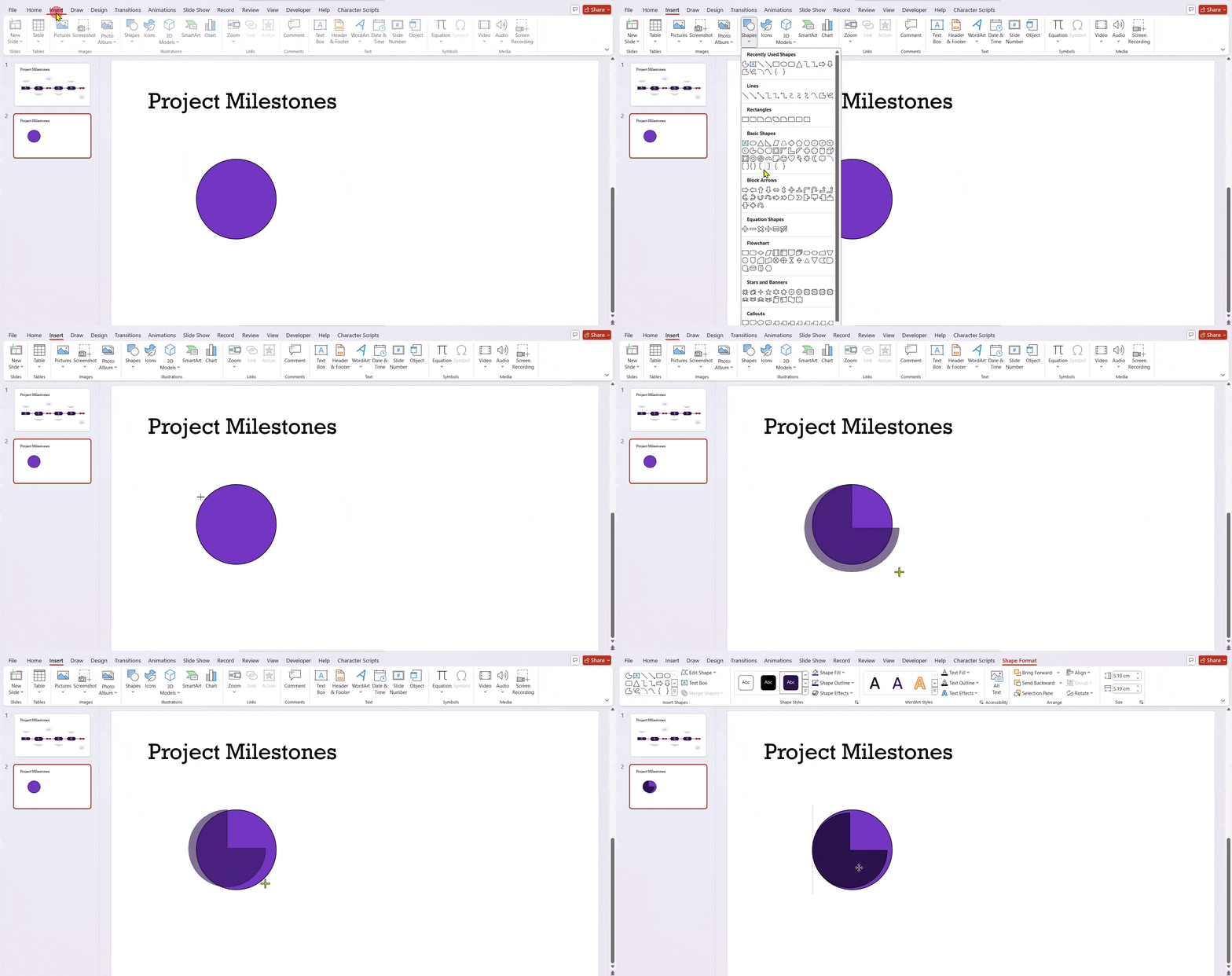
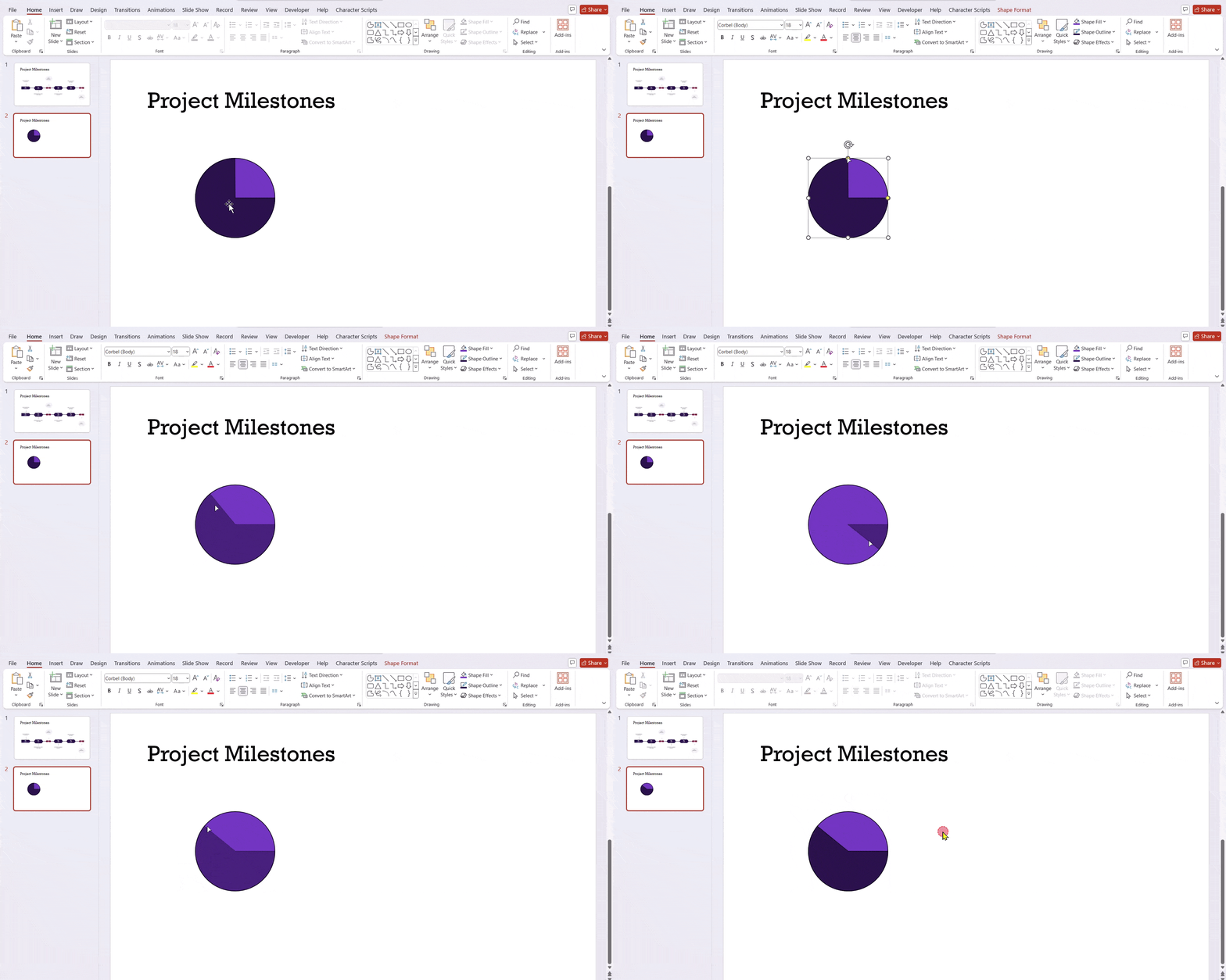
Step – 4. Fill Level: Click the partial circle to select it. You’ll see small yellow handles. Drag these to change the angle, which controls how much of the circle is filled in your Harvey Ball.
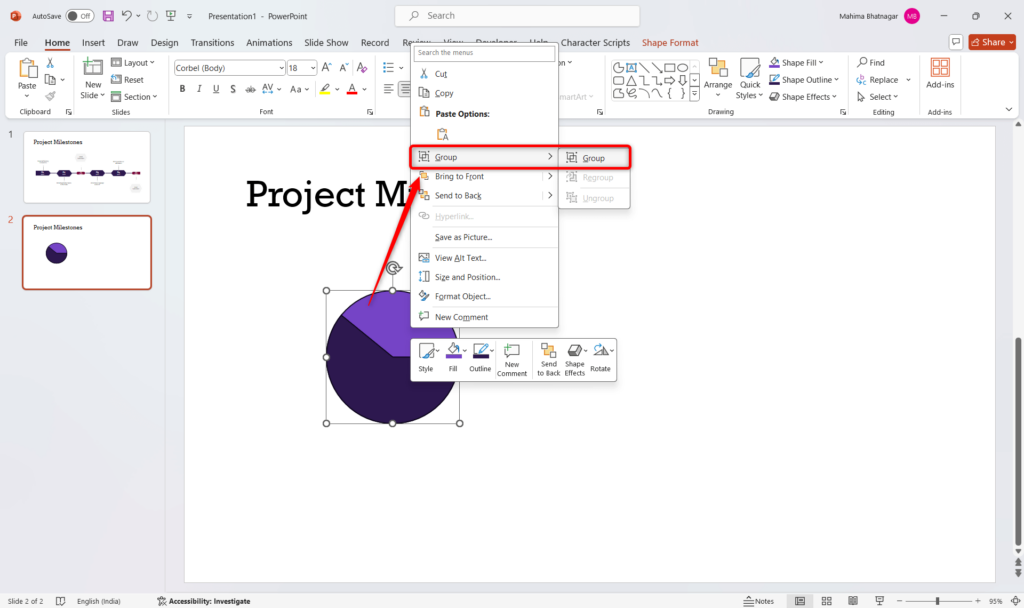
Step – 5. Grouping (Optional): To make it easier to manage, you can select both shapes and right-click, then choose “Group.” This will combine them into a single Harvey Ball graphic.
Create Presentations Easily in Google Slides and PowerPoint
14M+Installs

What are the Benefits of Harvey Balls in PowerPoint Presentations?
Harvey Balls offers several advantages that can make your PowerPoint presentations more effective:
1. Clear and Easy to Use: Harvey Balls provide a straightforward way to show qualitative information. They can take complex data and make it easier for your audience to understand quickly.
2. Save Space on Slides: Instead of filling slides with lots of text or detailed charts, you can use Harvey Balls to keep information concise, freeing up valuable space. This leads to cleaner and more visually pleasing presentations.
3. Show Non-Numerical Data – Harvey Balls work well for showing qualitative information that might be difficult to express with numbers. The amount of shading in the circle can easily convey ideas like progress, risk level, or customer satisfaction.
4. Improve Understanding: By replacing slides with lots of text with clear visuals, Harvey Balls can help your audience understand and remember information better. They can also act as a starting point for discussion, encouraging questions and making your presentation more interactive.
5. Flexible and Adaptable: Harvey Balls can be used for many presentation needs. You can use different colors, shading, or even add icons inside the circle to show different categories or breakdowns. This flexibility allows you to customize them to fit your specific data and message.
6. Easy to Understand for Everyone: The simple design of Harvey Balls makes them easy to understand, regardless of language. This offers a visual communication tool that can be grasped by audiences from all backgrounds.
Build Stunning Slides in Seconds with AI
- No design skills required
- 3 presentations/month free
- Don't need to learn a new software

Closing Thoughts
Harvey Balls are a powerful tool that can take your PowerPoint presentations to the next level. By using these simple visuals, you can effectively communicate qualitative data, save space on slides, improve audience understanding, and create more engaging presentations. So next time you’re faced with presenting complex information, consider using Harvey Balls to bring your message to life!
Frequently Asked Questions About Making Harvey Balls in PowerPoint
What are Harvey balls used for?
Harvey balls are used in presentations to show:
- Project status and progress
- Comparisons between different options or data points
- Overall performance or completion levels
Which font has Harvey balls?
To access Harvey Balls, select your text box and navigate to the Insert tab. Locate the Symbol option. In the font dropdown menu, select “Segoe UI Symbol,” and under the subset dropdown, choose “Geometric Shapes.” There you’ll find the Harvey Ball choices. Just click the insert button to add them to your text box.
What can I use instead of Harvey balls?
Consider these alternatives to Harvey Balls:
- Charts: Bar charts, pie charts, or heatmaps can effectively display comparisons or data proportions.
- Icons: Simple icons can represent achievement levels or categories.
- Emojis (use with caution): Emojis can add a touch of informality but ensure clarity for your audience.


