
Presenting survey results is more than just showing numbers; it’s about turning data into a clear and meaningful story your audience can understand. Whether you’re sharing customer feedback, employee insights, or market research findings, an effective survey results presentation helps you highlight trends, draw conclusions, and inspire action. By using visuals, structure, and the right tools, you can make your data not only informative but also engaging and persuasive.
What is a survey result presentation?
A survey results presentation is a structured way of displaying and explaining the findings from a survey. It turns raw data, such as responses, percentages, and trends, into clear insights that are easy to understand. Instead of overwhelming the audience with numbers, it organizes information using visuals like charts, graphs, and key takeaways. The goal is to help viewers quickly understand the data’s meaning, identify patterns, and make informed decisions based on the results.
Why is it important to present survey results?
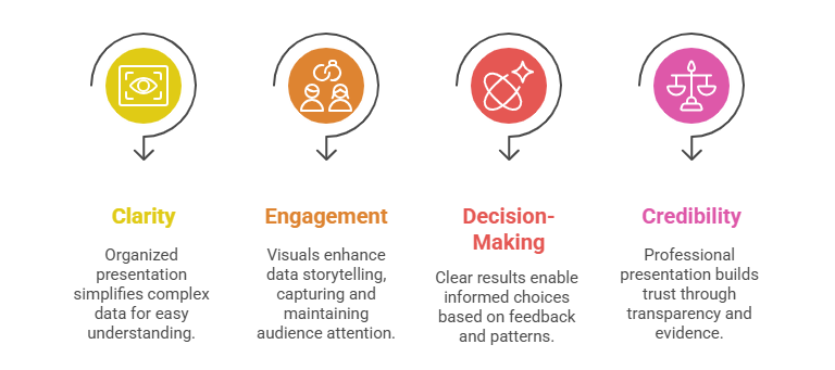
Presenting survey results effectively is crucial because it helps transform complex data into meaningful insights that drive understanding and action.
- Clarity: A well-organized presentation turns raw survey numbers into simple, digestible information, making it easier for audiences to grasp key findings.
- Engagement: Visuals like graphs, infographics, and highlights make data storytelling more interesting and keep the audience focused.
- Decision-Making: Clear survey results help businesses, educators, or researchers make informed choices based on real feedback and patterns.
- Credibility: Professionally presented data builds trust and demonstrates transparency, showing that conclusions are supported by real evidence.
What are the Key Components of Survey Result Presentation?
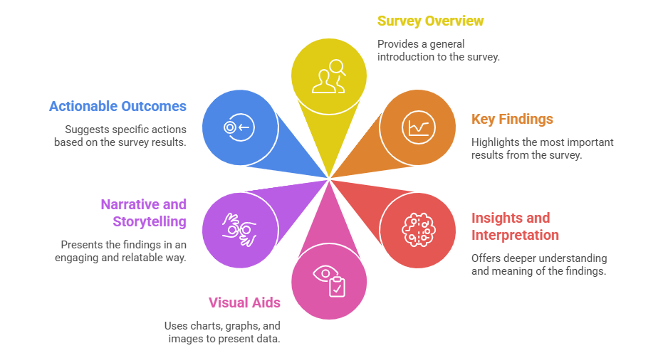
Presenting survey results that are strong include several key components that turn raw data into meaningful insights and clear next steps:
- Survey Overview: Start by outlining the purpose, objectives, and methodology of the survey, who participated, how data was collected, and the sample size. This sets the context for your audience.
- Key Findings: Highlight the most important results using visuals such as charts, graphs, and tables. Focus on data that supports your main message or reveals significant trends.
- Insights and Interpretation: Go beyond the numbers, explain what the data means, identify patterns, and provide actionable insights that relate to real-world implications.
- Visual Aids: Use clear visuals to enhance understanding.
- Charts and Graphs show trends or comparisons.
- Infographics combine visuals and text to tell a story.
- Tables organize detailed data neatly for easy reference.
- Narrative and Storytelling: Present data as a story that connects with your audience emotionally and intellectually. This helps them understand not just what the data says, but why it matters.
- Actionable Outcomes: End with clear recommendations or next steps based on your findings, helping stakeholders make informed decisions and take meaningful action.
Create Presentations Easily in Google Slides and PowerPoint
14M+Installs
How to Create a Survey Result Presentation?
Presenting survey results effectively helps communicate key insights clearly and persuasively. A structured, slide-by-slide approach ensures that your audience understands the findings and their implications. Here’s a detailed breakdown to help you design a professional survey result presentation:
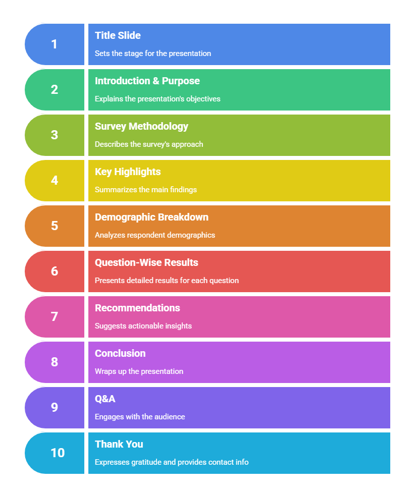
Slide 1: Title Slide
Start with a clean, professional title slide. Include the survey name, your organization’s logo, presenter name, and the presentation date. This sets the tone and gives the audience context.
Slide 2: Introduction & Purpose
Briefly explain why the survey was conducted, its main objectives, and what insights the audience will gain. This helps frame expectations right from the beginning.
Slide 3: Survey Methodology
Describe how the survey was carried out, mention the target audience, sample size, data collection method, and timeframe. Keep it concise but detailed enough to build credibility.
Slide 4: Key Highlights (Executive Summary)
Summarize the most important findings and trends from the survey. Use bullet points or simple infographics to highlight major takeaways that will be discussed in detail later.
Slide 5: Demographic Breakdown (Respondent Profile)
Present a quick overview of the participants, including age, gender, location, or occupation. Pie charts and bar graphs work well to visualize demographics.
Slide 6: Question-Wise Results (Main Body)
Show responses to key survey questions. Use charts and graphs like bar charts, line graphs, or percentages for clarity. Focus on patterns, comparisons, or standout results that support your conclusions.
Slide 7: Recommendations / Actionable Insights
Turn findings into actions. Suggest strategies or improvements based on survey data. This shows that the research has real-world applications.
Slide 8: Conclusion
Wrap up with a concise summary of the key takeaways. Reinforce what the survey revealed and its overall significance for decision-making or strategy development.
Slide 9: Q&A / Discussion
Invite questions from the audience. This encourages engagement and clarifies any doubts about the results or insights presented.
Slide 10: Thank You / Contact Slide
End the presentation on a professional note. Include your name, email, and company information so viewers can reach out for further details or collaboration.
This structured approach ensures your survey results are not only informative but also easy to follow, engaging, and visually impactful
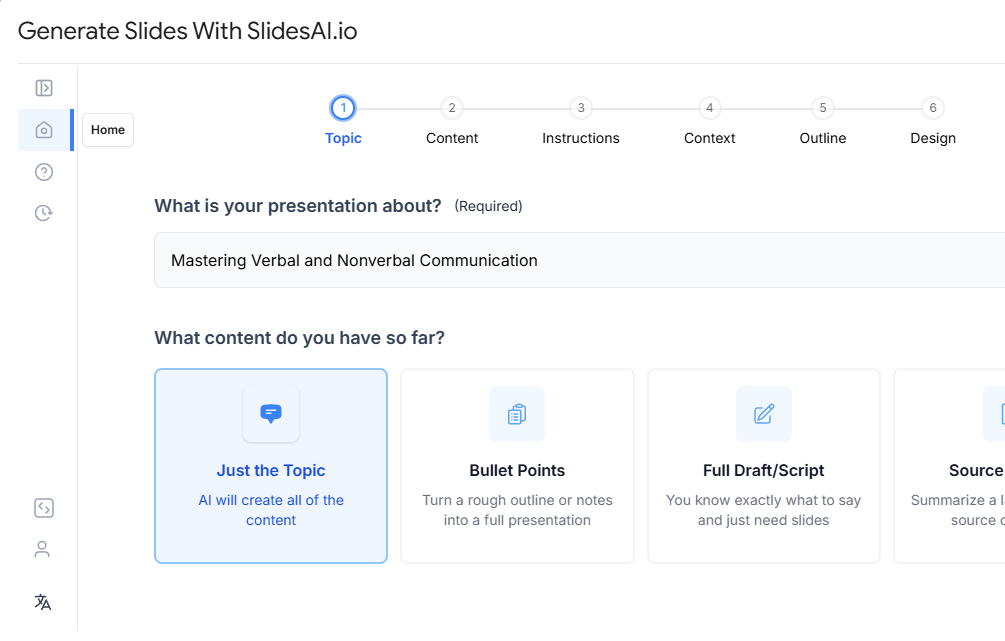
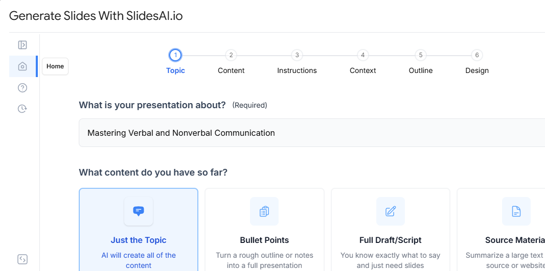
Once you’ve analyzed your survey findings, SlidesAI’s AI PowerPoint Generator can help you transform key insights into a clear, professional presentation. Simply provide your content and let AI create structured slides in minutes.
Best Practices for a Professional Survey Result Presentation
Creating a professional and engaging survey results presentation requires more than just showing numbers; it’s about presenting them in a way that’s clear, focused, and visually consistent. Here are some best practices to follow:
- Know Your Audience: Tailor your content based on who’s viewing it. Focus on insights that are most relevant to their interests or goals.
- Focus on Key Insights: Avoid overwhelming your audience with too much data. Highlight only the findings that truly matter and support your presentation’s purpose.
- Use Clear and Simple Language: Replace complex terms with simple, direct language. Your goal is to make the data easy for everyone to understand, not just analysts.
- Maintain a Consistent Design: Use a clean, minimalistic layout with uniform fonts, colors, and chart styles. Consistency makes your presentation look polished and professional.
SlidesAI for Creating a Survey Result Presentation
Creating a survey results presentation can be a challenge, especially when you’re dealing with large amounts of data, multiple response categories, and detailed visual analysis. Many presenters struggle with making the data both informative and engaging. Common mistakes include overcrowding slides with numbers, using inconsistent visuals, or failing to connect insights to clear takeaways.
This is where SlidesAI steps in as a game-changer. As one of the best AI presentation makers, SlidesAI can instantly transform raw survey insights or text summaries into polished, professional slides. It automatically organizes your data, selects relevant visuals, and applies design consistency, saving hours of manual formatting.
For survey-based decks, SlidesAI’s pre-designed templates are especially useful. Templates like the Pie Chart Presentation Template help represent response distribution effectively, while the Venn Diagram Presentation Template is perfect for showing relationships or overlaps between audience segments or survey categories.
Build Stunning Slides in Seconds with AI
- No design skills required
- 3 presentations/month free
- Don't need to learn a new software
A well-designed survey results presentation does more than just share data; it tells a story that helps teams and stakeholders make informed decisions. By using clear visuals, focusing on insights, and maintaining a consistent design, you can turn complex findings into actionable takeaways. Tools like SlidesAI make this process even easier by automating design and layout, saving you time and effort. Whether you’re presenting feedback, customer research, or internal surveys, combining strong data storytelling with AI-powered tools ensures your message connects clearly and professionally.
Frequesntly asked questions about Survy Result Presentation
How do you start a survey result presentation?
Begin with a clear introduction, state the purpose of the survey, why it was conducted, and what the audience can expect.
How long should a survey presentation be?
Presenting survey results ideally should have 10–15 slides to cover key points without overwhelming the audience.
Should you include survey methodology in the presentation?
Yes, a short section on methodology builds credibility and helps the audience understand the context.
Can AI tools help create survey result presentations?
Yes, tools like SlidesAI can quickly turn survey insights into professional slides with charts and layouts.
How do you summarize survey results in a presentation?
Focus on the most important findings, group similar responses, and highlight key statistics with visuals.
How do you organize survey findings in slides?
Start with objectives, then demographics, followed by key findings, insights, and recommendations.
Should raw data be included in a survey presentation?
No, raw data is better suited for appendices; present only summarized insights in slides.