
Bar graphs in PowerPoint are one of the most effective ways to present data visually. Whether you’re preparing a business report, student project, or sales presentation, learning how to make a bar graph in PowerPoint ensures your message is clear, professional, and engaging. In this guide, you’ll learn step by step how to create a bar graph in PowerPoint like a pro, and also edit and customize it.
What Is a Bar Graph?
A bar graph, also known as a bar chart, is a visual representation of data using rectangular bars. These bars can be displayed vertically or horizontally, with their length or height reflecting the values they represent. Bar graphs are widely used because they make it simple to compare data across different categories at a glance. For example, they can show sales performance by product, survey results across age groups, or growth trends over time. Their straightforward structure and versatility make bar graphs one of the most common and effective tools for presenting information clearly.
How to make a Bar Graph in PowerPoint
Adding a bar graph in PowerPoint is simple and only takes a few steps. Here’s how you can do it:
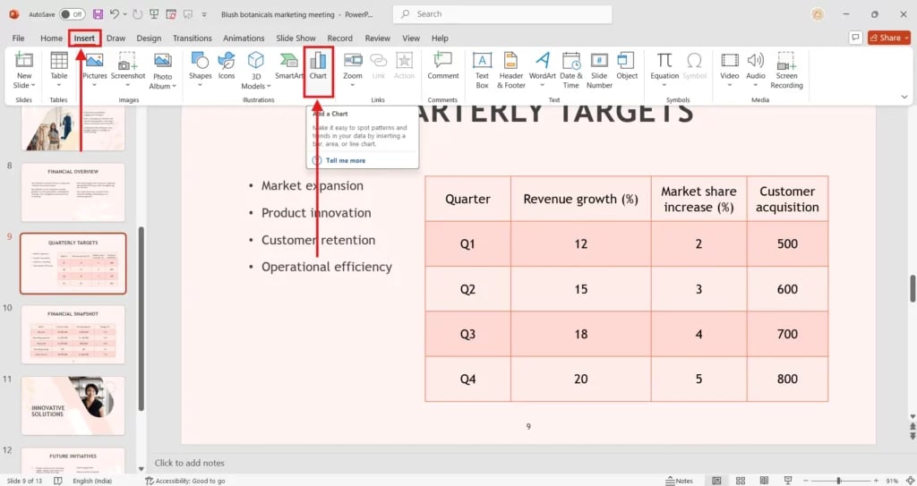
Step 1: Go to the Insert Tab
Open your PowerPoint slide and click on the Insert tab in the top menu. From here, select the Chart option to get started.
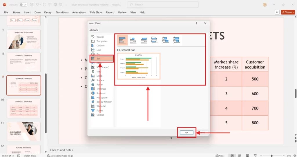
Step 2: Insert the Bar Chart
A pop-up window will appear showing different chart types. Choose Bar from the left-hand menu, then select your preferred style (such as Clustered Bar or Stacked Bar). Click OK to insert it into your slide.
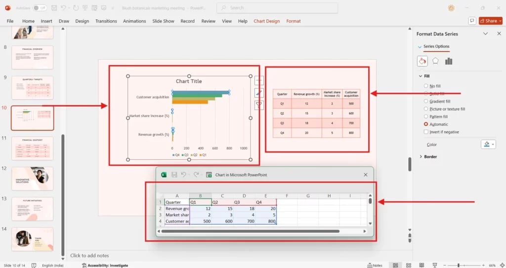
Step 3: Add and Edit Data
Once the chart appears, an Excel sheet will automatically open. Enter your data into the sheet, and the bar graph in PowerPoint will update in real-time. You can adjust values, categories, and series to fit your needs.
Step 4: Format Your Bar Chart
After your data is in place, customize the look of your chart. Use the Chart Design and Format options to change colors, add labels, or adjust layouts. This step ensures your bar graph matches the style of your presentation.
Customizing Your Bar Graph
Once your bar graph is inserted, you can make it more engaging and tailored to your presentation. PowerPoint offers several options to edit and style your chart for maximum impact. Here’s how you can do it:
1. Editing Data
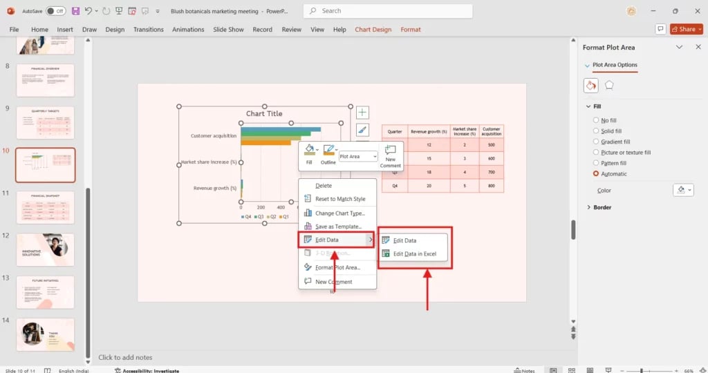
- Right-click on the chart and select Edit Data.
- An Excel sheet will appear where you can add or update values, categories, and series.
- Any changes you make in Excel will instantly reflect in your PowerPoint chart.
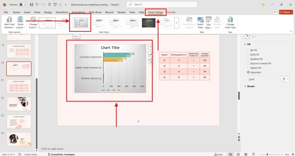
2. Change the Chart Style
- Go to the Chart Design tab on the top menu.
- Browse through the available chart styles and select one that best fits your presentation theme.
- Styles help you quickly apply professional designs with borders, effects, and layouts.
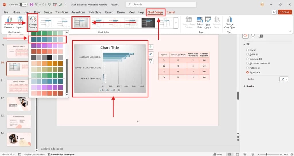
3. Change the Colors
- Under Chart Design, click on Change Colors.
- Choose from a range of color palettes to match your brand, theme, or preference.
- This makes your bar graph visually appealing and easier to understand.
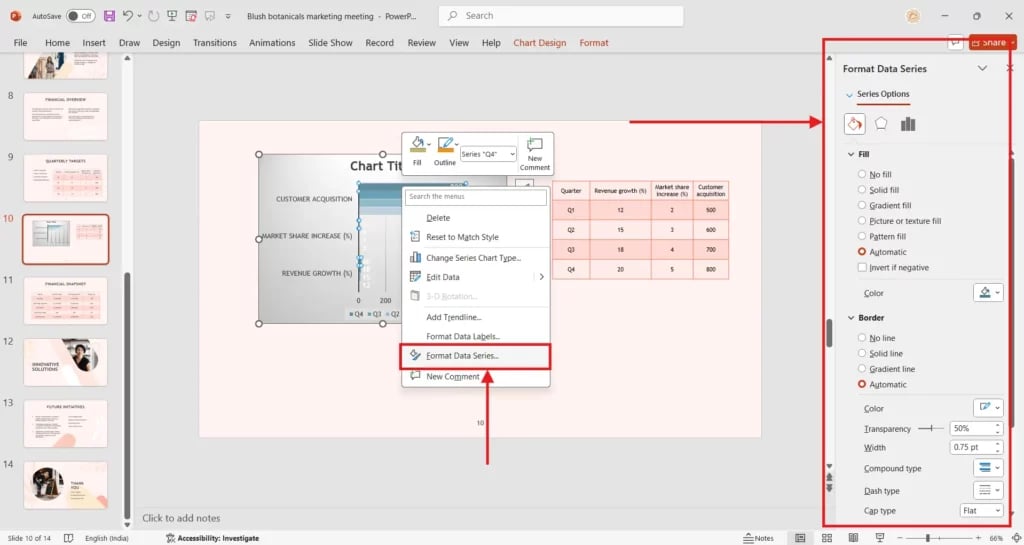
4. Adjusting Bar Spacing and Layout
- Select the bars in your graph and right-click to open Format Data Series.
- Use the Series Options to adjust the Gap Width (space between bars) and Overlap (if multiple series exist).
- A tighter or wider spacing can change the overall readability of your chart.
Creating a bar graph in PowerPoint is quick, simple, and highly effective for visual storytelling. By learning how to create a bar graph in PowerPoint, you can transform raw numbers into engaging visuals that highlight trends, simplify comparisons, and strengthen your presentation. Whether for business, academics, or personal projects, mastering bar graphs in PowerPoint helps you present with confidence and clarity. Start applying these steps today and take your presentations to the next level.
Create presentation slides with AI in Seconds in PowerPoint
- No design skills required
- 3 presentations/month free
- Don't need to learn a new software
Works with PowerPoint

FAQs
1. Can I edit the data in a bar graph after inserting it?
Yes. Simply click on the chart, then choose the Edit Data option. This reopens the linked spreadsheet, allowing you to update or replace values. Any changes made here will automatically refresh the graph in your PowerPoint slide.
2. What’s the difference between a bar graph in PowerPoint and a column chart?
A bar chart uses horizontal bars to represent values, while a column chart displays vertical bars. Both serve the same purpose of comparing data, but bar charts are especially useful when dealing with longer text labels or when space is limited on the slide.
3. How do I customize the colors and layout of my bar graph?
Click the chart and navigate to the Chart Design or Format tabs. Here, you can adjust bar colours, change layouts, add chart titles, edit axis labels, or apply professional themes to create a polished, visually appealing bar graph tailored to your presentation style.