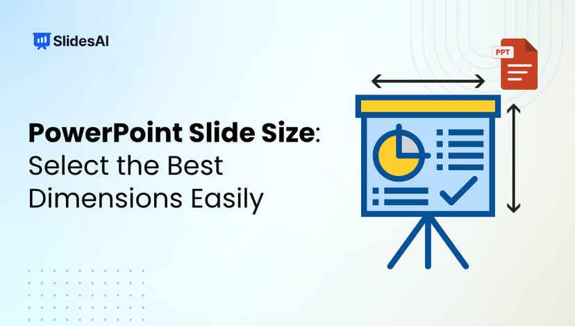
SlidesAI For PowerPoint Add-in is LiveInstall Now

How to Create a Gantt Chart in PowerPoint?

How to Create a Gantt Chart in PowerPoint?

Table of Contents

Trying to plan a project or keep track of deadlines using plain text can get messy and confusing. Whether you’re working on a team presentation or managing a timeline for a school or office task, you need something that clearly shows what needs to be done and when. That’s where a Gantt chart comes in. It helps you break down tasks, assign timelines, and visually organize everything in one place. And the good news is, you can make a clean and simple Gantt chart right inside PowerPoint without using any fancy tools.

What is a Gantt Chart?

A Gantt chart is a visual way to plan and manage a project. It shows tasks as horizontal bars across a timeline, letting you see when each task starts and ends. You can also track how much work is done, which tasks depend on others, and spot any delays before they become a problem. It’s a go-to tool for project managers who want to stay on top of deadlines and resources.

Why Use a Gantt Chart in PowerPoint?

If you’re presenting your project to a team or client, a Gantt chart in PowerPoint can make things a lot clearer. It helps you show your plan visually, so everyone can see what’s happening and when. You can easily adjust the design to match your presentation style. It also makes it simple to track tasks and timelines without using complex software. For stakeholders who just need a quick overview, this is a clear and effective way to share updates.

Create Presentations Easily in Google Slides and PowerPoint

15M+Installs

slidesai

Methods to Create a Gantt Chart in PowerPoint

There are two methods to create a gantt chart in PowerPoint. Here’s a closer look at them:

  1. Creating a Gantt Chart Manually
  2. Creating a Gantt Chart Using a Stacked Bar Chart

Method 1: Creating a Gantt Chart Manually

If you’re working on a simple project or want full control over how your Gantt chart looks, the manual method is a good option. Here’s how to create one directly in PowerPoint:

Step 1: Prepare Your Slide

Start by opening a blank slide. Delete any default text boxes so you have a clean space to work with.

Step 2: Add a Timeline Guide (Optional)

For better alignment, go to Insert > Table and insert a table with columns that represent time intervals like weeks or months. Use rows to represent tasks. This guide helps you keep everything neat as you build your chart.

Step 3: Draw the Task Bars

Now go to Insert > Shapes and choose the Rectangle tool. Draw one rectangle (or bar) for each task. The length of the bar should reflect how long the task will take. For example, a task that lasts two weeks should have a bar twice as long as a one-week task.

Step 4: Label Your Chart

Use the Insert > Text Box tool to add task names on the left side of the bars. Then, above the chart, label your time intervals like “Week 1,” “Week 2,” and so on. This makes your chart easy to understand at a glance.

Step 5: Customize the Design

You can adjust the colors, fonts, and shapes to make your chart look clearer and more visually appealing. Keep it simple and clean so it’s easy to read during a presentation.

💡 Pro Tip:

Use color coding to show task status. For example:

  • Blue for tasks that are in progress
  • Green for completed tasks
  • Red for delayed tasks

This adds a visual layer of information without cluttering the slide.

Method 2: Creating a Gantt Chart Using a Stacked Bar Chart

If your project has many tasks or if you want your chart to update automatically when your data changes, this method is a better fit. It’s a little more technical but very efficient.

Step 1: Insert a Stacked Bar Chart

Go to Insert > Chart > Bar > Stacked Bar. PowerPoint will open an embedded Excel sheet alongside your chart.

Step 2: Input Your Gantt Chart Data

Replace the sample data with your own. You’ll need three columns:

  • Column A: Task names
  • Column B: Start dates or number of days from the project start
  • Column C: Task durations (in days)

Each row should represent a task.

Step 3: Format the Chart

Right-click on the chart and select Select Data. Adjust the data range to include only the three columns you just added. You can also remove any unnecessary elements like legends or gridlines for a cleaner look.

Step 4: Hide the Start Date Bars

To make the chart look like a traditional Gantt chart, select the first data series (these are usually the blue bars showing the start date), right-click, and choose Format Data Series. Then go to the Fill option and select No Fill. This will make the start date bars invisible so only the duration bars are visible.

Step 5: Final Customizations

Change the colors of the task bars to make them easier to distinguish. You can also add data labels to show exact durations or start dates. These small details make your chart more informative and polished.

Both methods work well. The manual one gives you design freedom while the stacked bar chart method saves time on updates and is better for tracking complex projects. Choose the one that fits your workflow best.

Tips for a Great Gantt Chart in PowerPoint

1. Keep it Simple

Try not to overcrowd your chart with too many tasks, labels, or tiny details. A clean and straightforward Gantt chart is much easier to understand. Focus on the main tasks that matter most and keep everything else minimal.

2. Choose the Right Timeline

For most projects, a weekly or monthly timeline works best. It gives a broad view of progress without getting lost in daily details. Keep your timeline format consistent across the chart so it’s easy to read at a glance.

3. Group Related Tasks Together

Visually group tasks that belong to the same phase or category. This helps the viewer quickly understand how different parts of the project connect. You can use spacing, lines, or colors to show these groups clearly.

By following these simple tips, your Gantt chart in PowerPoint will not only look better but also work better for your audience.

Closing Thoughts

Creating a Gantt chart in PowerPoint doesn’t have to be complicated. Once you understand the steps, it becomes a handy tool for planning and sharing project timelines in a clear and simple way. Whether you’re managing tasks for a team or organizing your own work, the right layout can help you stay on track. Just keep things neat, focused, and easy to follow.

Build Stunning Slides in Seconds with AI

  • No design skills required
  • 3 presentations/month free
  • Don't need to learn a new software
slidesai

Frequently Asked Questions Related to Creating a Gantt Chart in PowerPoint

1. Can I import a Gantt chart from Excel to PowerPoint?

Yes, you can. If you’ve created a Gantt chart in Excel, simply copy it and paste it into your PowerPoint slide. This way, the formatting stays intact, and you can still edit the chart if needed. It’s a quick way to transfer your work without starting from scratch.

2. Is there a Gantt chart template in PowerPoint?

PowerPoint doesn’t come with a built-in Gantt chart template, but you’re not out of options. You can find plenty of free or paid templates online that are ready to use. If you prefer to build your own, try using a stacked bar chart to design one manually.

3. Can I reuse my Gantt chart slide for other projects?

Definitely. You can save your Gantt chart slide as a template or simply duplicate it into another presentation. Just change the task names, adjust the dates, and you’re ready to go. This saves time and keeps your project timelines consistent.

4. How do I represent progress on tasks in a Gantt chart?

To show progress, use different colors or shading within the task bar. For example, if a task is halfway done, fill half of the bar with a different shade or color. This makes it easy for your audience to quickly see what’s in progress and what’s complete.

5. Can I add milestones to a Gantt chart in PowerPoint?

Yes, you can add milestones by placing small shapes like diamonds, circles, or stars on your timeline. These represent important events or deadlines. Label each milestone clearly so viewers can understand what they mean and when they’re expected.

Turn Text into Stunning Presentations Instantly with SlidesAI!

Design stunning, unique slides with AI-generated visuals and text. Say goodbye to boring templates with our free AI presentation maker

App screenshot