
Infographics are one of the best ways to make complex information easy to understand and visually appealing. Instead of overwhelming your audience with text and numbers, infographics help you tell a clear, engaging story through visuals, icons, and data. The good news? You don’t need fancy design software to create them; PowerPoint has all the tools you need to design stunning, professional-looking infographics in minutes.
In this guide, you’ll learn how to create infographics in PowerPoint step-by-step, along with tips to make your designs clean, impactful, and presentation-ready. Whether you’re building a business report, marketing pitch, or classroom project, this method will help you turn your ideas into visuals that stand out.
Key Takeaways
- You can easily create infographics in PowerPoint using SmartArt, templates, or manual design.
- Always plan your layout and use consistent colors, fonts, and spacing for a professional look.
- Icons and visuals make information easier to understand and more engaging.
- Turn on Gridlines and Guides to align elements neatly.
- Export your infographic as a PNG, JPEG, or PDF for easy sharing.
- Use SlidesAI’s infographic templates to save time and design polished visuals effortlessly.
What Is an Infographic?
An infographic is a visual representation of information that combines text, icons, charts, and images to explain a topic in a clear and engaging way. Instead of relying on long paragraphs or dense data, infographics simplify complex ideas into visuals that are quick to understand and easy to remember. They’re perfect for sharing facts, statistics, processes, or comparisons in a format that captures attention instantly.
Method 1: How to Create an Infographic in PowerPoint Using SmartArt Graphics
PowerPoint’s SmartArt Graphics feature makes creating infographics quick and simple, even if you’re not a designer but wondering how to create infographics in PowerPoint; these built-in templates help you visually organize information, whether it’s a process, comparison, or data summary. Here’s a step-by-step guide to help you design a professional-looking infographic using SmartArt.
Step 1: Set the Slide Size
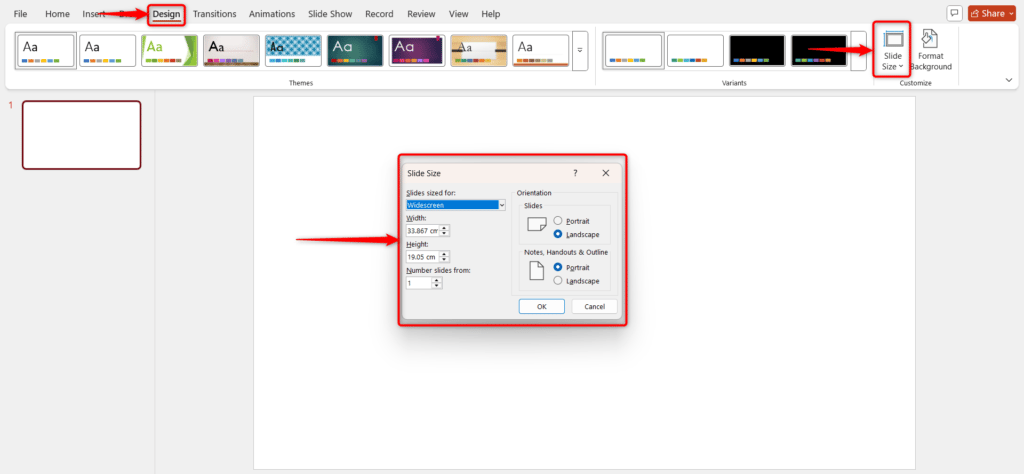
Go to the Design tab and click Slide Size → Custom Slide Size. Choose dimensions that fit your infographic layout, vertical for social media or horizontal for presentations, and hit OK to apply.
Step 2: Open SmartArt Graphics
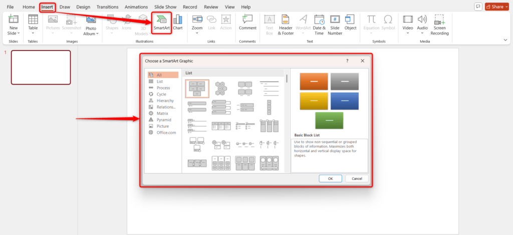
Click on the Insert tab and select SmartArt under the Illustrations group. This opens PowerPoint’s SmartArt gallery with different layout options.
Step 3: Choose a Graphic
Browse through the available SmartArt categories like Process, Hierarchy, or Cycle. Pick one that best represents your data and click OK to add it to your slide.
Step 4: Customize Data Points
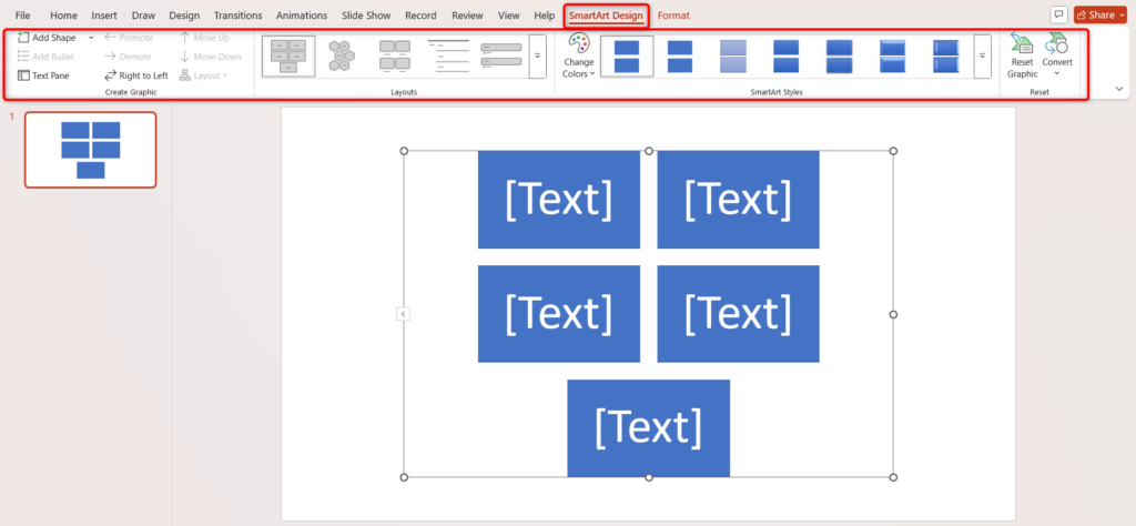
You can add or remove elements by selecting your SmartArt graphic and using the Add Shape or Remove Shape buttons under the SmartArt Design tab.
Step 5: Insert Your Data
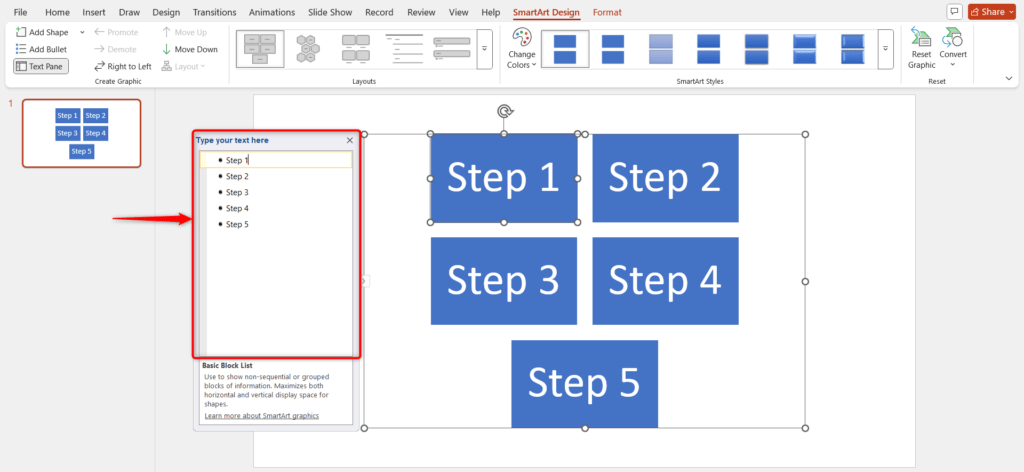
Click inside the text boxes within the SmartArt shapes and type in your key information, such as statistics, steps, or short phrases.
Step 6: Edit Text and Imagery
Highlight your text to change the font, size, or color. You can also right-click on any shape to replace it with an icon or image that fits your design.
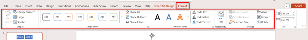
Step 7: Adjust Colors
To match your branding or theme, select the SmartArt graphic, go to the SmartArt Design tab, click Change Colors, and choose your preferred color palette.
Step 8: Add Numbering or Flow Indicators
Make your infographic easier to follow by adding numbers or arrows. Go to Insert → Shapes → Arrow or use Add Shape to create directional flow.
Step 9: Finalize and Polish
Align all elements properly using Format → Align, check spacing for balance, and preview your slide. Adjust any uneven text or icons to ensure your infographic looks clean, consistent, and professional
Create Presentations Easily in Google Slides and PowerPoint
14M+Installs
Method 2: How to Create an Infographic in PowerPoint Manually
If you want full control over your design, creating an infographic in PowerPoint manually is a great option. This method allows you to customize every element, from layout and colors to fonts and icons, so your design perfectly fits your content and brand style. Follow these simple
Step 1: Set Up the Slide
Click on the Design tab, select Slide Size, choose Custom Slide Size, set the dimensions that best fit your infographic, and click OK to apply.
Step 2: Add a Background
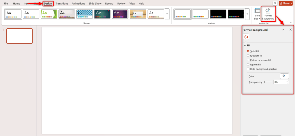
Go to the Format Background option in the Design tab, choose a solid color, gradient, or image that complements your infographic theme, and click Apply to all slides if needed.
Step 3: Insert Shapes
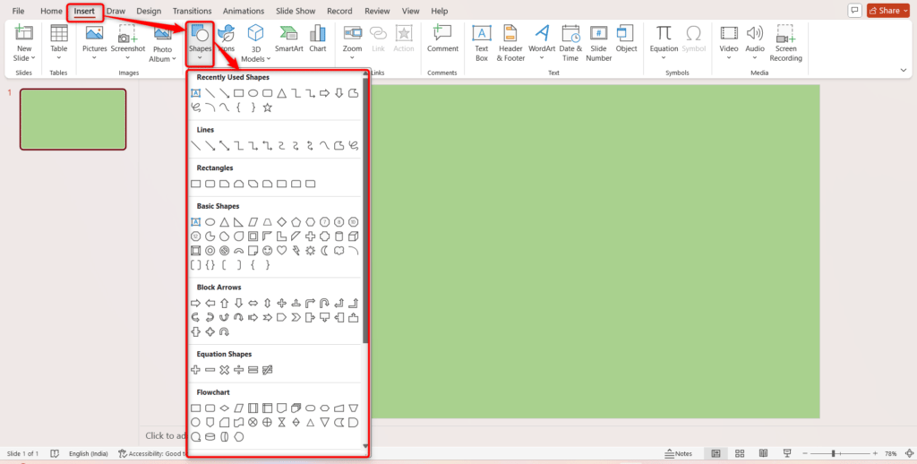
Go to the Insert tab, click Shapes, and choose rectangles, circles, arrows, or merge shapes to create sections and visual elements for your infographic. Draw them onto the slide as needed.
Step 4: Add Icons and Images
Click on Insert → Pictures or Icons, select the images or icons that represent your data, and place them appropriately within your shapes or sections.
Step 5: Add Text
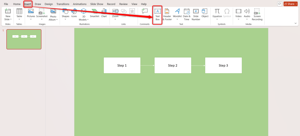
Click Insert → Text Box, draw the text box in your desired location, and type in your headings, data points, or descriptions. Adjust font, size, and color to match the infographic style.
Step 6: Use Lines and Arrows
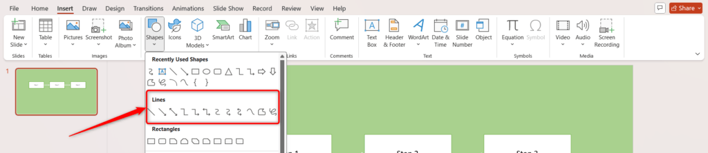
Go to Insert → Shapes → Lines or Arrows to connect elements, show flow, or indicate relationships between sections of your infographic.
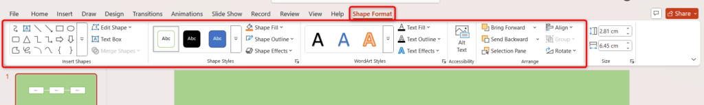
Step 7: Apply Colors and Styles
Select shapes, icons, or text, then use the Format tab to change colors, add shadows, gradients, and change the color of the bullet point or other visual effects to make the infographic visually appealing.
Step 8: Arrange and Align Elements
Use Format → Align options to evenly space and align text boxes, shapes, and images for a clean and organized layout.
Step 9: Review and Finalize
Double-check all text, icons, and shapes for accuracy and consistency. Make final adjustments to spacing, colors, and sizes to ensure the infographic is clear and profile
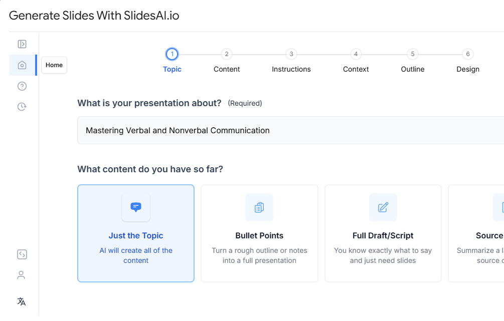
For a quicker way to build visually engaging slides, try SlidesAI’s AI PowerPoint Generator, which helps transform your content into well-designed presentations in minutes.
Method 3: How to Create an Infographic Using a PowerPoint Template
If you’re short on time or new to design, using a PowerPoint infographic template is the easiest way to create a professional-looking visual. PowerPoint provides several ready-to-use templates that you can customize in just a few clicks, perfect for reports, marketing materials, or presentations.
- To get started, open PowerPoint and go to File → New. In the search bar, type “infographic” and browse through the available templates. Once you find one that matches your topic or data style, click Create to open it on a new slide.
- Replace the placeholder text and icons with your own content. You can change colors, fonts, and images to match your brand or theme, and even add or remove sections as needed. For extra customization, insert charts, SmartArt, or shapes to enhance your infographic’s layout.
- When you’re done, double-check the design for readability and flow. Finally, save or export your slide as an image or PDF to share it easily. Using templates helps you design faster while keeping your infographic clean, polished, and visually engaging.
Build Stunning Slides in Seconds with AI
- No design skills required
- 3 presentations/month free
- Don't need to learn a new software
Tips for Creating Infographics in PowerPoint
Creating an infographic in PowerPoint becomes much easier when you know a few smart tricks. These tips will help you create clean, visually balanced designs that not only look great but are also easy to understand. Whether you’re presenting data, timelines, or comparisons, these small steps make a big difference.
-
Use Gridlines and Guides:
Turn on gridlines and guides from the View tab to align shapes, icons, and text precisely. This keeps your layout structured and professional-looking.
-
Group Elements:
Select multiple objects and press Ctrl + G (Windows) or Cmd + G (Mac) to group them. Grouping helps you move or resize elements easily while keeping your layout intact.
-
Use Icons Instead of Text:
Insert icons via Insert → Icons to replace long sentences or labels. Icons simplify your message, reduce clutter, and make your infographic more visually appealing.
-
Copy Formatting Quickly:
Use the Format Painter tool to duplicate colors, fonts, and styles between objects. It saves time and keeps your entire infographic visually consistent.
-
Lock Aspect Ratios:
When resizing shapes or images, hold Shift to preserve their proportions. This prevents distortion and maintains a polished, professional look.
-
Layer Smartly:
Right-click on elements and choose Bring to Front or Send to Back to manage overlapping visuals. Proper layering ensures clarity and emphasizes the right content.
-
Use Consistent Colors:
Go to Design → Variants → Colors and pick a color theme that suits your message. Stick to that palette throughout for a cohesive and harmonious design.
-
Add Subtle Effects:
Use soft shadows, gradients, or outlines from the Format Shape menu to add depth. Keep effects minimal for a clean, modern look.
-
Duplicate Elements for Speed:
Press Ctrl + D (Windows) or Cmd + D (Mac) to quickly copy shapes or text boxes. This keeps spacing uniform and speeds up your design process.
-
Zoom Out to Check Layout:
Zoom out to get a bird’s-eye view of your design. This helps you spot misalignments, uneven spacing, or unnecessary clutter before finalizing.
If you want to save time while still creating professional-quality visuals, explore SlidesAI’s infographic templates. These ready-to-use templates help you design engaging, data-driven infographics in minutes, without needing advanced design skills.
Create Presentations Easily in Google Slides and PowerPoint
- No design skills required
- 3 presentations/month free
- Don't need to learn a new software
Conclusion
Creating infographics in PowerPoint is one of the easiest ways to turn data and ideas into visually appealing stories. With the right layout, colors, and icons, you can communicate complex information clearly and keep your audience engaged. By following the steps and tips above, you’ll be able to design infographics that look professional, organized, and impactful, all within PowerPoint.And if you want to save time while achieving a stunning, polished presentation, try the infographic presentation template Collection SlidesAI’s infographic templates. They make it effortless to design eye-catching visuals in just a few clicks, helping your presentations stand out every time.
Frequently Asked Questions About Creating Infographic in PowerPoint
1. How can you create infographics in PowerPoint from scratch?
To make one from scratch, start with a blank slide and set your preferred slide size under the Design tab. Then, add shapes, icons, and text boxes to organize your information. Keep the layout simple and use matching colors and fonts for a polished, professional look.
2. Can I use SmartArt to create an infographic in PowerPoint?
Yes! SmartArt makes it easy to create well-structured infographics. Just insert a graphic from the Insert → SmartArt menu, fill in your content, and adjust colors, curve text and styles to suit your theme.
3. What are the best shapes and icons to use in a PowerPoint infographic?
Stick to basic shapes like rectangles, circles, arrows, and lines to organize content clearly. Use icons from Insert → Icons to represent ideas visually; they make your infographic easier to understand and more engaging.
4. How do I make my infographic visually appealing in PowerPoint?
Focus on simplicity and balance. Use consistent colors or change color schemes, legible fonts, and even spacing. Add subtle effects like shadows or gradients to create depth without cluttering the design.
5. How do I align the text boxes and space elements properly in a PowerPoint infographic?
Turn on Gridlines and Guides from the View tab to keep everything aligned. You can also use Format → Align to evenly space elements and group them for easier adjustments.
6. Is it better to use templates or design infographics manually in PowerPoint?
Both have their benefits. Templates are perfect if you want a quick, ready-made layout, while manual design gives you full creative control. Choose what fits your timeline and design experience.
7. How do I export my PowerPoint infographic as an image or PDF?
Go to File → Save As, and choose PNG, JPEG, or PDF as the file type. You can export just one slide or the entire presentation, depending on your needs.