


What is Harvey Balls Diagram Template?
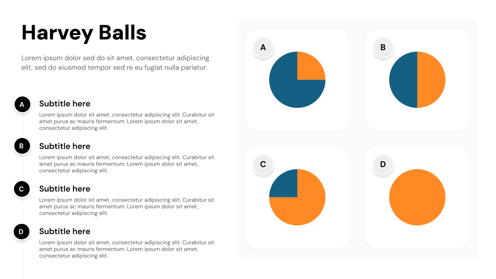
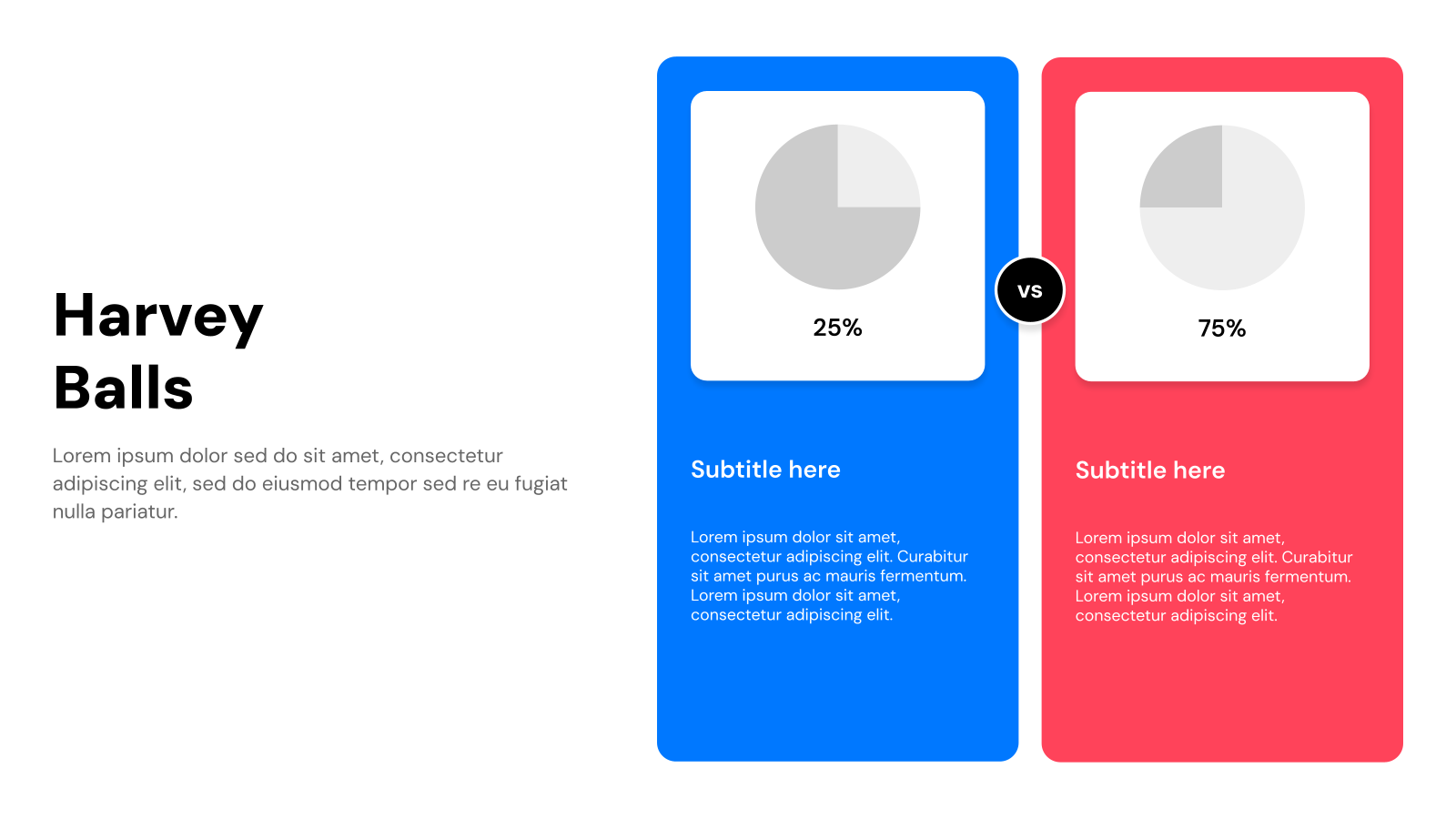
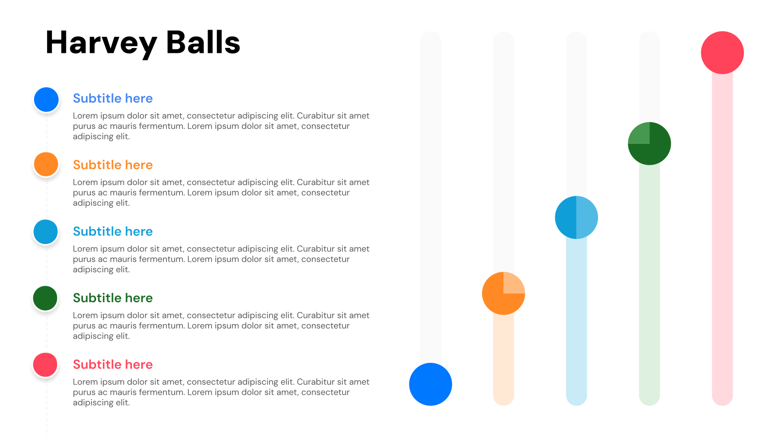
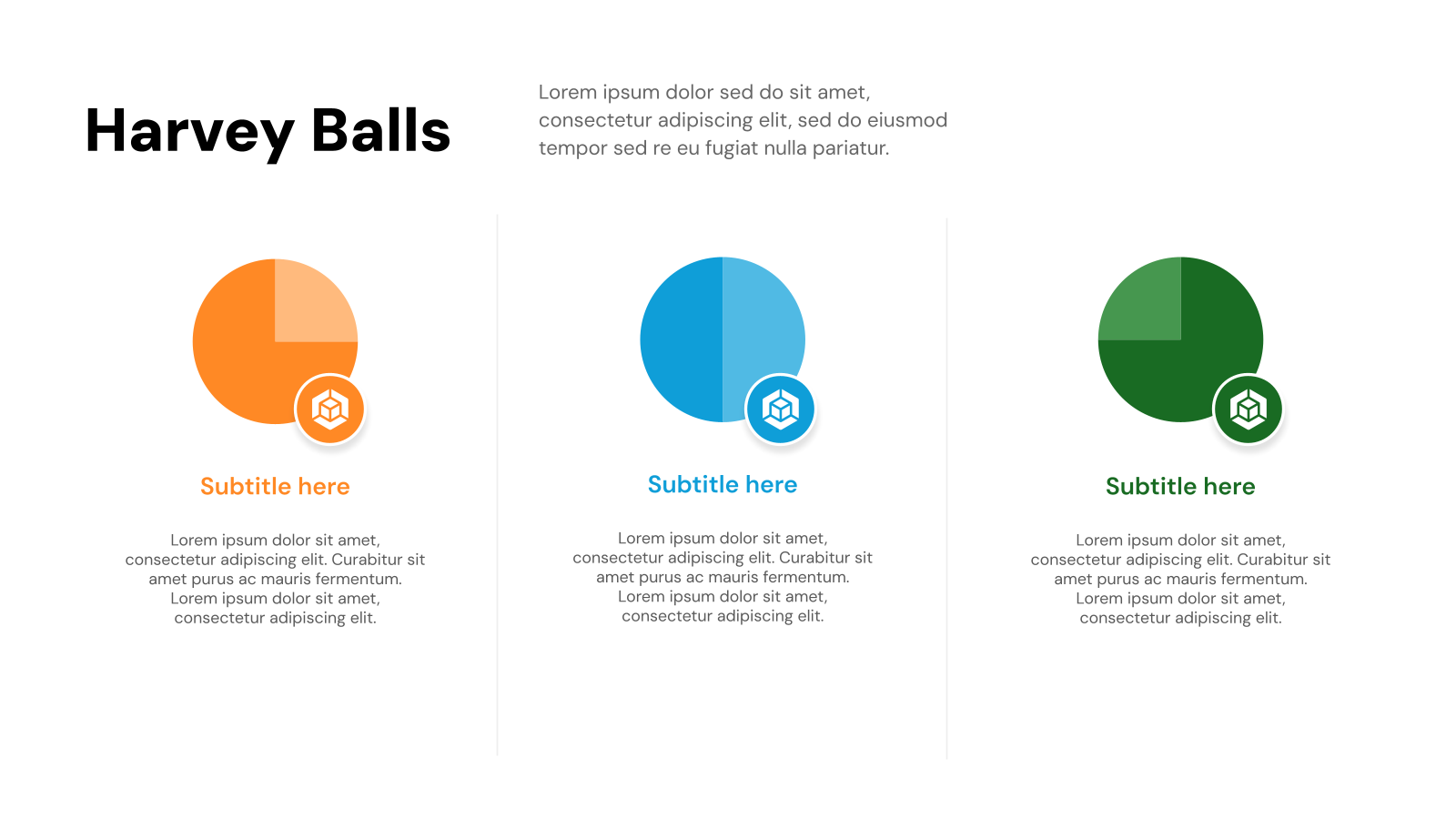
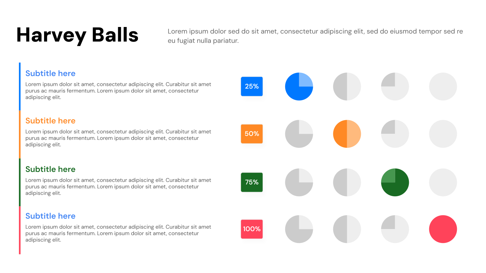
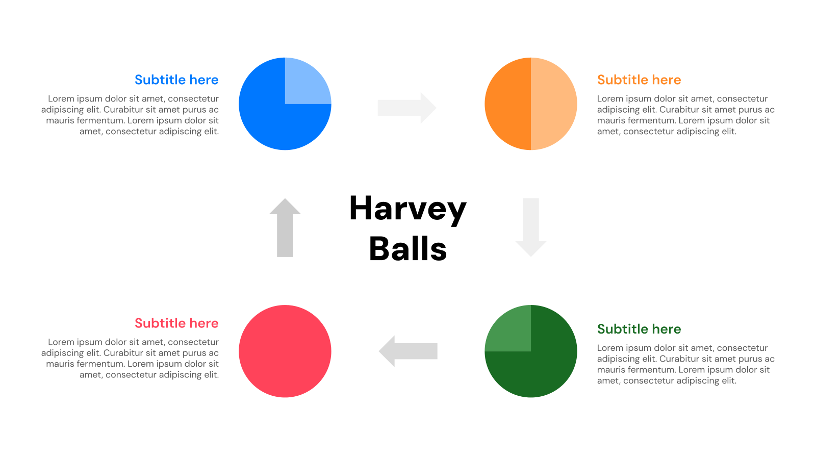
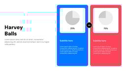
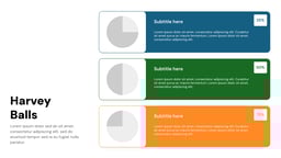
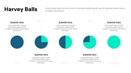
Harvey Ball diagram templates use simple circles with different levels of shading to show progress, completion, or comparison. The more the circle is filled, the higher the level of completion or performance.
For example, a half-filled circle shows that a task is 50% complete. These diagrams help people quickly understand information without reading long explanations and are commonly used in reports and presentations.
Where Can You Use This Harvey Balls Template in Presentation?
- Showing Data Clearly: Harvey Balls turn numbers or percentages into simple visuals, making progress and comparisons easy to understand at a glance.
- Comparing Different Options: They help quickly compare products, strategies, or results by showing strengths and weaknesses visually.
- Highlighting Key Information: Harvey Balls can draw attention to important details like performance levels, risks, or quality ratings.
- Showing Feedback and Ratings: They are useful for presenting customer satisfaction, team performance, or survey results in a clear and engaging way.
Why Choose Our Harvey Balls Templates?
- Easy to Use: The templates are simple to edit and customize in PowerPoint or Google Slides.
- Clear Visuals: Harvey Balls make information easy to understand at a glance.
- Professional Design: Clean and modern layouts help your presentation look polished.
- Saves Time: Ready-made slides help you create presentations quickly.
- Versatile Use: Perfect for comparisons, progress tracking, ratings, and reports.
How to Use Harvey Balls Template for Presentation?
- Microsoft PowerPoint: Click on Download > Click on “PowerPoint” > Click on the downloaded file to make a copy and start customizing/editing the template.
- Google Slides: Click on Download > Click on “Google Slides” > Click on “Use Template” to make a copy and start customizing/editing the template.
Build Stunning Slides in Seconds with AI
- No design skills required
- 3 presentations/month free
- Don't need to learn a new software
Frequently Asked Questions About Harvey Balls Templates
1. How do you create Harvey Balls in PowerPoint?
Creating Harvey Balls in PowerPoint is easy. You can either use built-in shapes or icons, or you can create them manually with partial circles. These simple steps allow you to make them quickly and customize them as needed.
2. How do you insert the Harvey Ball symbol in PowerPoint?
To insert the Harvey Ball symbol into your PowerPoint slide, follow these steps:
- Click on a text box or an empty cell in a table where you want the symbol.
- Go to the Insert tab at the top of your screen.
- Click on Symbol.
- In the font dropdown menu, select Segoe UI Symbol.
- Then, in the subset dropdown, choose Geometric Shapes.
- Scroll through the options and select the Harvey Ball you want.
- Finally, click Insert to add it to your slide.
3. What’s the difference between a pie chart and a Harvey Ball?
Harvey Balls and pie charts serve different purposes. While Harvey Balls are simple, round symbols used to show progress, status, or comparisons, pie charts display parts of a whole in percentages. Harvey Balls are great for quick, visual comparisons, while pie charts are more suited for showing detailed data breakdowns and distributions.
4. What can you use instead of Harvey Balls?
If you want alternatives to Harvey Balls, you might consider using pie charts or data bars. These options can be helpful for displaying data in a different format, depending on what you’re trying to communicate. Both can offer more detailed or nuanced information compared to Harvey Balls.
5. What’s another name for Harvey Balls?
Harvey Balls are sometimes referred to as Booz Balls. These symbols are used for visual communication in various fields, including business, astronomy, meteorology, and even cartography.