
Fonts may seem like a small design choice, but they play a major role in how your presentation is understood. A good font makes your slides easier to read, keeps attention on the message, and helps your content look polished without extra effort. On the other hand, the wrong font can make even strong ideas feel cluttered or difficult to follow.
When choosing a presentation font, the goal is simple. You want something clear, readable, and comfortable to view across screens, projectors, and different room sizes. In this guide, we will look at how to choose the right presentation font, common mistakes to avoid, and which fonts work best for different presentation styles.
Why Do Fonts Matter So Much in Presentations?
Fonts affect how quickly people understand your content. During a presentation, viewers only spend a few seconds looking at each slide. If the font is hard to read, too decorative, or too small, your message gets lost.
Good fonts help guide the eye naturally. They make titles stand out, keep body text readable, and create a consistent look across slides. Fonts also shape the tone of your presentation. A clean sans serif font feels modern and professional, while a classic serif font can feel formal or academic.
Choosing the right font is not just about design. It directly affects readability, attention span, and audience understanding.
Best Tips for Using Fonts in Presentations Effectively
Here’s a closer look at some of the best tips for using fonts in your presentations effectively:
1. Pick Fonts That Work for Every Viewer
Your presentation may be viewed on a laptop, projector, large screen, or shared as a PDF. Choose fonts that stay clear in every format. Simple fonts with balanced spacing work better than thin or highly stylized options.
Avoid fonts that look good only on your own screen. Test readability from a distance before finalizing.
2. Less Is More
Too many fonts create visual clutter. Most presentations work best with two fonts at most.
Use one font for titles and another for body text if needed. Keeping fonts limited creates a cleaner design and helps slides feel connected from beginning to end.
3. Never Pair Fonts That Look Too Similar to Each Other
When fonts are too alike, they can make slides feel inconsistent rather than intentional. Pairing should create contrast.
For example, combining a strong heading font with a softer body font creates balance. Using two fonts that differ slightly in weight or spacing often feels awkward instead of polished.
4, Use Font Sizes and Styles to Build a Clear Visual Hierarchy
Viewers should instantly know where to look first. Larger font sizes signal importance, while smaller text supports details.
Titles should stand out clearly from body text. Bold styles can highlight important numbers, key phrases, or takeaways without needing extra design elements.
5. Choose Font Colours That Contrast Well With Your Background
Good contrast improves readability immediately. Dark text on a light background or light text on a dark background usually works best.
Avoid low contrast combinations such as grey text on white slides or bright colours against busy backgrounds. The easier text is to read, the more professional your presentation appears.
Five Recommended Fonts for Presentations

These fonts work well because they stay readable across devices and suit different presentation styles.
1. Helvetica
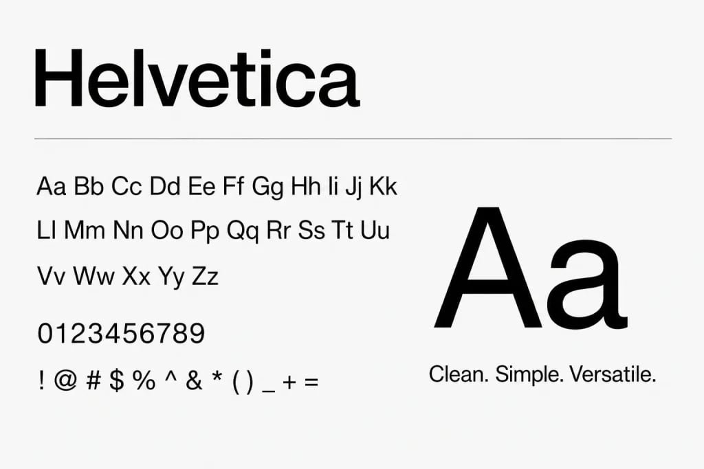
Where to use: Business presentations, startup pitches, professional reports, minimalist slides.
One benefit: Clean spacing and strong readability make it reliable for almost any presentation style.
2. Calibri
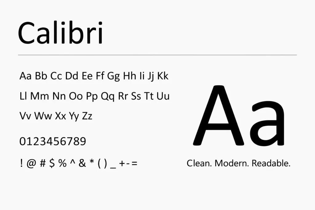
Where to use: Corporate presentations, classroom slides, internal reports, everyday PowerPoint decks.
One benefit: Designed for screen readability, making it comfortable to read even in smaller text sizes.
3. Garamond
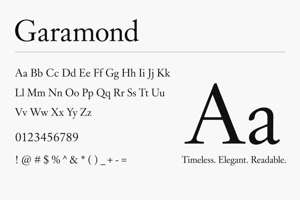
Where to use: Academic presentations, literature topics, formal speaking sessions.
One benefit: Gives slides a refined and classic feel without looking outdated.
4. Futura
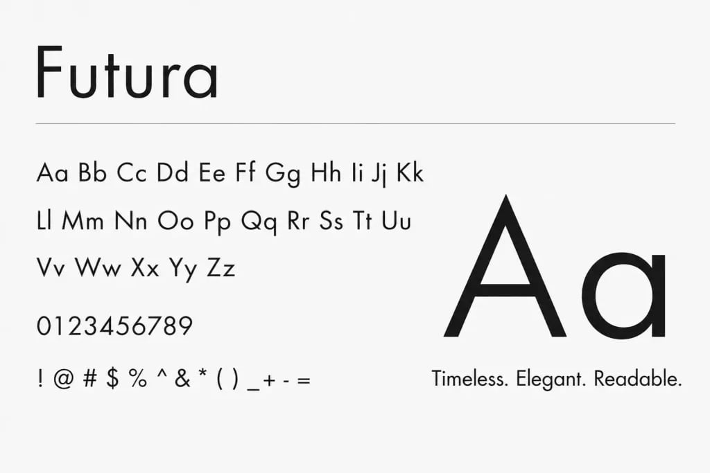
Where to use: Creative portfolios, design presentations, branding decks.
One benefit: Strong geometric shapes give slides a modern and confident appearance.
5. Verdana
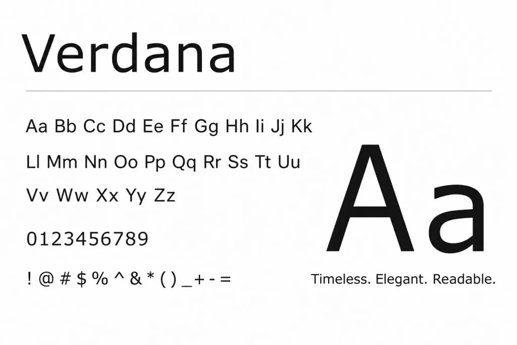
Where to use: Online presentations, webinars, educational content, text heavy slides.
One benefit: Wide letter spacing improves readability on digital screens.
If you want to explore more font styles and presentation friendly typography, you can read more here: SlidesAI’s guide to presentation fonts.
Popular Font Pairings
Choosing one font is important, but pairing fonts properly can improve presentation design even more. Here’s a closer look at some of the most popular font pairings you can use in your presentations:
1. Helvetica and Garamond
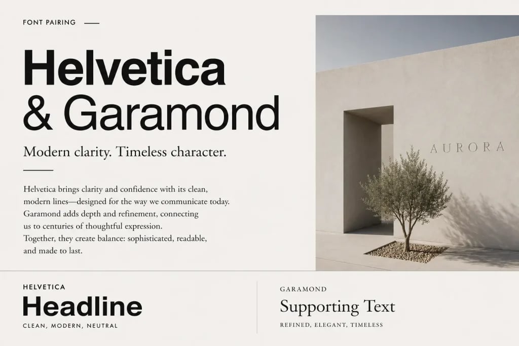
This pairing works well when you want a professional look with a touch of sophistication. Helvetica keeps titles modern, while Garamond adds elegance to supporting text.
2. Futura and Tahoma

A good option for modern presentations. Futura works well for bold headlines, while Tahoma keeps body text easy to read.
3. Calibri and Verdana

This combination feels simple and familiar. It works especially well for business slides or presentations with large amounts of text.
Explore our presentation templates for professionally designed slides with balanced typography and layouts.
Avoiding Common Font Mistakes
Even good fonts can fail when used incorrectly. Here are some mistakes that often make presentations harder to read.
1. Using Too Many Fonts
Adding multiple fonts creates inconsistency. Slides begin to feel disconnected and visually noisy.
2. Choosing Overly Decorative Fonts
Fancy fonts may look interesting, but they usually reduce readability. Presentation fonts should support clarity, not distract from it.
3. Ignoring Readability for Style
Thin fonts, script fonts, or tightly spaced lettering often look stylish but become difficult to read from a distance.
4. Inconsistent Alignment
Font alignment matters as much as the font itself. Text that shifts between center, left, and uneven spacing makes slides feel unorganized.
How SlidesAI Takes Care of Fonts and Design for You
Choosing fonts manually can take time, especially when you are unsure what works best together. This is where SlidesAI helps simplify the process.
Instead of adjusting typography slide by slide, the tool automatically applies readable font combinations, balanced hierarchy, and clean formatting based on your content. It helps you avoid common font mistakes without needing design experience.
You can focus on writing your ideas while the presentation structure, typography, and visual consistency are handled automatically.
Create Presentations Easily in Google Slides and PowerPoint
14M+Installs

Closing Thoughts
Fonts are not just decoration. They shape how your presentation feels and how easily people understand it.
The best presentation fonts are readable, simple, and consistent. Choosing the right font means thinking about your audience, viewing distance, slide layout, and presentation style. Small typography choices often have a larger impact than people expect.
Keeping fonts clean, limiting combinations, and maintaining strong contrast can make your slides look more professional without extra effort.
FAQs
1. How do I find the best font for my presentation?
Start with readability. Choose fonts that remain clear on large screens and from a distance. Sans serif fonts often work best for presentations because they appear clean and easy to scan quickly.
2. What font size is recommended for PowerPoint slides?
Titles usually work well between 28 and 40 points. Body text is commonly readable between 18 and 24 points. Larger rooms may require slightly bigger text.
3. Can I use Google Fonts in my PowerPoint presentation?
Yes. You can download fonts from Google Fonts and install them on your computer before using them in presentation software. Just make sure the font is embedded when sharing the file so it displays correctly on other devices.