
Professionals giving pitches, instructors creating lecture slides, and students working on class projects all require visually appealing and simple-to-follow slides. However, if you don’t know where to begin, creating a presentation can feel overwhelming.
You can create slides that effectively convey your message and capture the audience’s interest by adhering to tried-and-true design rules for PowerPoint presentations. You can use these rules as your roadmap while creating a presentation. They make your slides look professional and work well.
Key Takeaways
- Following presentation design rules helps your slides communicate ideas clearly and keep the audience engaged.
- Limiting slides, text, and complexity with rules like 10/20/30 and 5/5/5 makes your presentation easier to follow.
- Using visual principles such as contrast, alignment, and the rule of thirds creates professional and balanced slides.
- Consistent fonts, colors, and spacing improve readability and create a polished appearance.
- Avoid overcrowding slides, inconsistent styles, and ignoring audience needs to prevent common presentation mistakes.
What are Presentation Design Rules?
In a nutshell, presentation design rules are guidelines that assist you in producing visually appealing and easily comprehensible slides. These are some effective guidelines for layout, content, graphics, and style. They address everything from the appropriate arrangement of images to the amount of text to use.
Using rules of designing a presentation keeps your slides structured and ensures your audience stays focused on what matters most.
Important Presentation Design Rules & Principles
Here are the main rules of designing a presentation that make your slides more effective.
Keep it Simple and Clear
- The 10/20/30 Rule: A good presentation shouldn’t drag on. Stick to roughly 10 slides, aim for 20 minutes, and use at least 30-point font. This keeps things concise and prevents your audience from getting lost in details.
- The 5/5/5 Rule: Too much text is exhausting. Limit slides to 5 words per line or per bullet point, 5 lines or bullet points per slide, and avoid stacking more than 5 text-heavy slides in a row. This makes it easy for people to read and follow your message.
- Group Related Content (Proximity): Place related points together. When information is organized logically, your audience can understand connections without extra explanation.
- Use Negative Space: White space isn’t wasted space. Leaving gaps around your text and visuals gives slides a clean look and helps important points stand out.
Make Slides Visually Engaging
- The Rule of Thirds: Dividing your slide into thirds horizontally and vertically can make your layout feel balanced. Key content along these lines naturally draws the eye.
- Contrast Matters: High contrast between text and background improves readability. Use differences in color, size, or shape to highlight what’s most important.
- Balance Your Elements: Slides should feel stable. Symmetrical layouts create order. Thus, uniformity is one of the critical rules of designing a presentation. Having said that, intentional asymmetry can also add interesting elements and energy to your presentation, if done carefully.
- Use Images Strategically: Humans remember visuals better than text. Icons, photos, and diagrams can help reinforce your points more effectively than paragraphs of words.
- Color Psychology: Colors can influence mood and focus. Choose shades that match your message, support your branding, and highlight key content.
- Repeat Visual Elements: Consistency in fonts, colors, and icons makes your slides feel cohesive and professional. Repetition subtly guides the audience through your presentation.
Pay Attention to Consistency and Readability
- Text Limit (6×6 or 7×7 Rule): Nobody wants to read endless text. Still, if the 5/5/5 rule is too strict for you, you can go with another ideal proportion according to the presentation design rules, that is, around 6 words per line and 6-7 lines per slide
- Maintain Uniform Fonts: Throughout, stick to the same font family and size.
- Hierarchy of Typography: Sometimes, you can use two or three complementary fonts. To clearly identify headings, subheadings, and body text, use size and weight differences.
- Align Everything: Verify the alignment of the text and images. Slides that are properly aligned appear polished and coordinated.
- Preserve Layouts and Templates: Slide templates, colors, and layouts that are consistent and suitable to your content type give your presentation a polished appearance. They make it easier for your audience to follow along.
Common Presentation Design Mistakes to Avoid
Apart from being aware of following the design rules for PowerPoint presentations, you also need to be careful of committing the common presentation mistakes. So, watch out for:
- Overcrowded Slides: Too much text or too many elements overwhelm the audience. Focus on the essential points.
- Mixing Fonts and Colors: Random styles break cohesion. Stick to your chosen color palette and font set if you are not sure about the effectiveness of the variations.
- Unreadable Text: Tiny fonts or low-contrast combinations make slides impossible to read. Always test visibility.
- Ignoring Audience Needs: Slides should support your message, not show off design skills. Consider your audience’s expectations and context at every step.
Read More: Discover the 32 most common presentation mistakes and how to avoid them.
Adhering to these golden rules of designing a presentation guarantees that you create visually appealing, lucid, and consistent slides. Well-designed slides help your ideas stick, not just look good. Moreover, it’s simple to follow these guidelines.
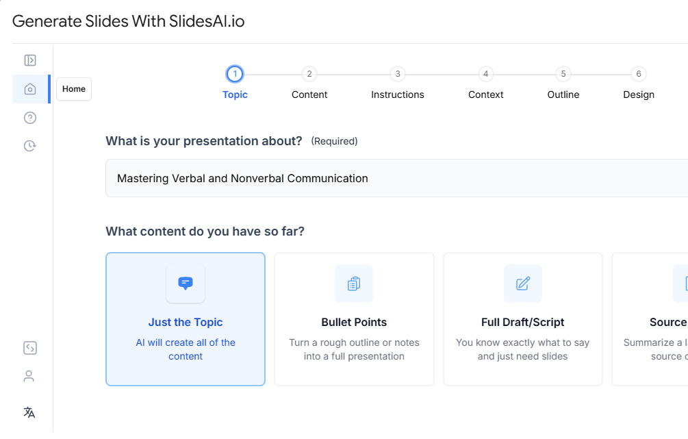
Also, remember that you can produce polished, business-like presentations fast without devoting hours to design when you use tools like SlidesAI.
Create Presentations Easily in Google Slides and PowerPoint
14M+Installs
Frequently Asked Questions
1. What are the most crucial presentation design rules?
Pay attention to readability, consistency, and clarity. Avoid using too much text, keep slides simple, and make good use of images. Slides are easier to understand when they follow guidelines like 10/20/30 and 5/5/5.
2. In presentations, how does the 10/20/30 rule operate?
It recommends keeping your presentation to 20 minutes, 10 slides, and a font size of 30 points. By doing this, you maintain your slides’ clarity, conciseness, and audience-friendliness.
3. How do universal design principles apply to presentations?
Alignment, contrast, and repetition are examples of universal design principles that guarantee slides are comprehensible, well-structured, and aesthetically pleasing for all audiences.
4. How can I keep my slides from being too crowded?
Group related content together and leave space around text by using guidelines like 5/5/5 and 6×6. Visuals can replace lengthy paragraphs.
5. What are common mistakes to avoid in presentation design?
Avoid overcrowded slides, inconsistent fonts or colors, unreadable text, and ignoring your audience. Focus on readability, alignment, and clean layouts.