Key Takeaways
- Visuals make presentations engaging and easy to understand.
- Use high-quality, relevant images and maintain consistency in style.
- Keep slides simple with one main idea per slide.
- Use contrast, white space, and purposeful animations for clarity.
- Tools like SlidesAI help create professional slides quickly and easily.
Visuals play a crucial role in making presentations engaging, memorable, and easy to understand. Text-heavy slides often overwhelm audiences, while compelling images, graphics, and design elements capture attention and simplify complex ideas. When used effectively, presentation aids like visuals, charts, and diagrams enhance comprehension and keep your message clear and impactful.
In today’s fast-paced world, strong visuals aren’t just an option; they’re essential. They help you connect with your audience emotionally, reinforce key points, and ensure your content sticks long after the presentation ends. The right visual strategy can transform a standard slideshow into a persuasive and memorable experience.
How to Create Visuals for Presentations?
Knowing how to create visuals for presentation key points isn’t about adding random images or graphics; it’s about designing with purpose. Every visual should support your message and enhance understanding. Here’s how to get it right:
1. Know Your Audience & Message
Before you start designing, take time to understand who your audience is and what your core message should convey. Are they industry experts who prefer data-driven visuals or a general audience that needs simple, clear illustrations?
Once you know this, tailor your visuals to match their level of understanding. For example, avoid jargon-heavy infographics for a beginner audience and use more conceptual diagrams instead. Your visuals should always reinforce your key message, ensuring that your audience can easily grasp and remember the main idea.
2. Choose the Right Type of Visual
Not all visuals serve the same purpose, so it’s essential to match your visual format to the content you’re presenting. For example, charts and graphs are ideal when you need to display numerical data or trends, while icons and illustrations can simplify complex concepts into digestible elements.
Images work best for storytelling, creating emotional impact, and making your slides more relatable. On the other hand, diagrams are excellent for explaining processes, workflows, or relationships between components. By aligning the type of visual with the message you’re communicating, you make your presentation clearer and more engaging.
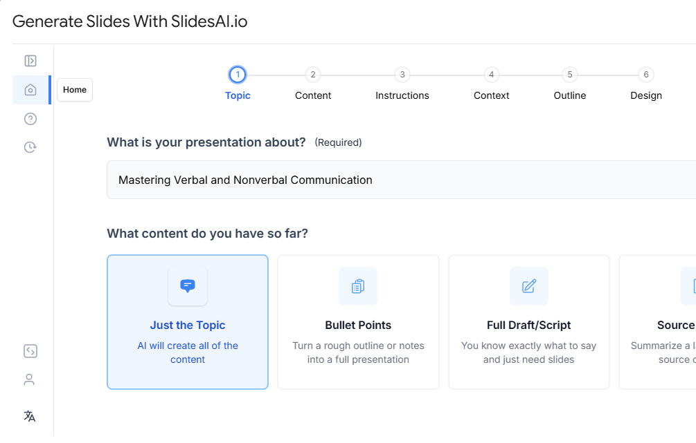
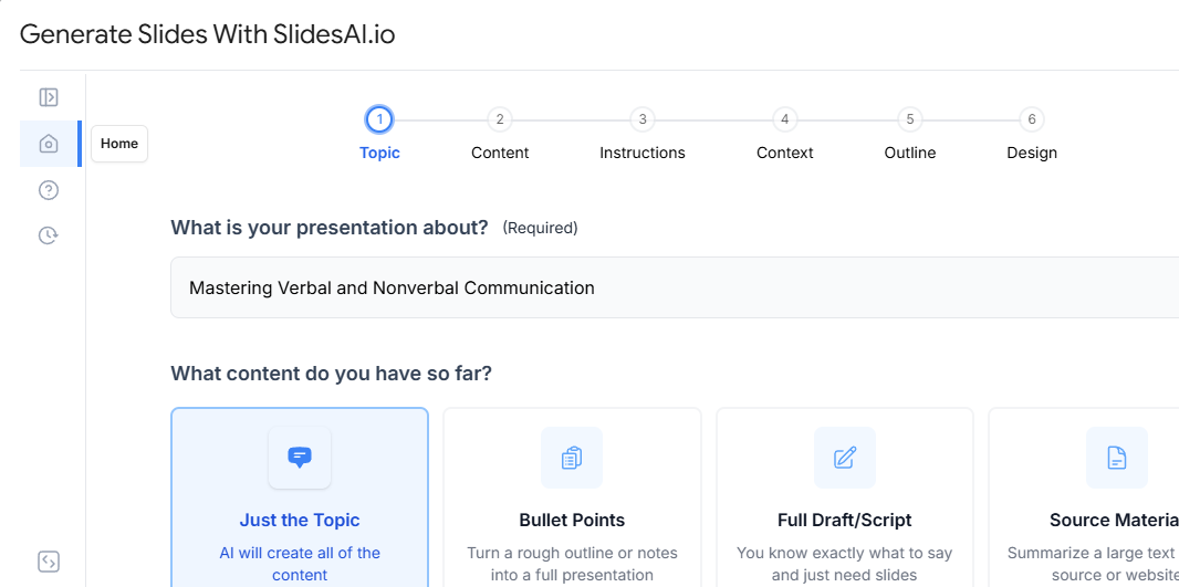
If you’re looking for a faster way to build slides around the right visual formats, try the AI PowerPoint maker from SlidesAI, it automatically matches your content with appropriate slide layouts and visuals.
3. Use High-Quality, Relevant Images
To understand how to create visuals for presentation that are impactful, always choose high-resolution visuals that appear sharp and polished on large screens. Blurry or pixelated images distract your audience and reduce the credibility of your message.
Equally important is relevance. Every image should have a clear purpose and connect directly to the topic you’re discussing. Avoid generic stock photos that feel staged or unrelated—they can make your presentation look inauthentic. Instead, opt for visuals that reinforce your narrative and help illustrate your points effectively.
4. Maintain Consistent Visual Style
Consistency is key to creating a professional and visually appealing presentation. Stick to a unified color palette, choose two or three fonts (maximum), and maintain consistent font sizes for headings and body text. This ensures your slides look organized and easy to follow.
Apply the same treatment to images, icons, and other graphic elements. For example, if you’re using flat-style icons, avoid mixing them with 3D icons or photos. A cohesive visual style not only looks polished but also keeps the audience focused on your message instead of unnecessary design variations.
If you want a head start, explore the SlidesAI templates for ready-to-use layouts that are already built around consistent design principles.
5. Keep It Simple and Focused
Simplicity is the secret to powerful presentations. Each slide should communicate one main idea supported by a single, impactful visual. Overloading your slides with multiple images, long text, or excessive data can confuse your audience and dilute your message.
Stick to concise text, just enough to complement your visual without overshadowing it. White space is your friend; it helps the design breathe and draws attention to the most important elements. A clean, focused slide ensures your audience stays engaged and understands your key points effortlessly.
6. Use Contrast and White Space
Contrast is essential for creating visual hierarchy and guiding your audience’s attention. Use differences in color, size, or shape to make key elements, like headings, data points, or calls to action, stand out on the slide. For example, a bold color for your headline against a neutral background can instantly draw the eye.
Equally important is white space. Leaving enough blank space around your text and visuals prevents your slide from looking cluttered and overwhelming. A balanced layout not only improves readability but also gives your presentation a polished, professional look.
7. Animate with Purpose
Animations can make your presentation more engaging, but they should serve a clear purpose. Use simple, subtle effects, like fades or slides, to reveal information gradually, helping your audience focus on one concept at a time. This technique works well for explaining processes or building a narrative without overwhelming viewers.
Avoid flashy transitions or excessive motion, as these can distract from your core message. The goal is to enhance understanding and maintain attention, not to turn your presentation into a visual spectacle.
8. Test on Multiple Devices
Before finalizing your presentation, preview it on different devices and display formats such as projectors, laptops, and mobile screens. This step ensures that your visuals remain clear, readable, and well-aligned regardless of screen size or resolution.
Testing helps you catch potential issues like blurry images, mismatched fonts, or color inconsistencies that might appear on certain screens. Making adjustments beforehand guarantees a smooth viewing experience for your audience.
9. Use Tools to Simplify Visual Creation
Creating high-quality visuals doesn’t have to be time-consuming or require advanced design skills. Tools like SlidesAI, Canva, Piktochart, and Venngage make it easy to design images, charts, and infographics that look professional and engaging.
These platforms offer templates, drag-and-drop interfaces, and customization options, allowing you to produce consistent and visually appealing graphics quickly. By leveraging these tools, you can focus more on content while ensuring your presentation visuals make a strong impact.
Create Presentations Easily in Google Slides and PowerPoint
14M+Installs
Tips for Creating Effective Presentation Visuals
Great visuals do more than decorate your slides, they communicate ideas clearly and keep your audience engaged. Here are key tips to follow:
- Use Visual Hierarchy to Guide Attention: Highlight key points using size, color, and placement.
- Tell a Visual Story: Arrange visuals in a sequence that conveys a clear narrative.
- Use Metaphors or Visual Analogies: Simplify complex ideas with familiar visuals.
- Design for Accessibility: Ensure readability with proper contrast, fonts, and alt text.
- Limit Data to the Essentials: Show only critical numbers in charts or graphs.
- Make Visuals Reusable Across Formats: Create adaptable graphics for slides, handouts, and social media.
- Use Branded Visual Templates: Maintain consistency with your brand colors and typography.
- Test for Emotion and Impact: Choose visuals that evoke the right feeling for your message.
- Balance Text-to-Visual Ratio: Keep slides clean with more visuals and less text.
- Avoid Overuse of Stock Icons and Emojis: Stick to authentic visuals for a professional look.
Create Stunning Visuals Effortlessly with SlidesAI
Knowing how to create visuals for presentation concepts from scratch can be time-consuming, especially if you’re not a professional designer. SlidesAI changes the game by using AI to automatically convert plain text into visually engaging slides. It eliminates the design stress so you can focus on delivering your message with impact.
With SlidesAI, you can:
- Transform bullet points into polished slide designs in seconds.
- Maintain a consistent visual style across your entire presentation.
- Save hours on formatting and choosing visuals manually.
- Ensure every slide is clear, professional, and audience-ready with minimal effort.
If you want a smarter, faster way to create impactful presentations, SlidesAI is your ultimate solution.
Build Stunning Slides in Seconds with AI
- No design skills required
- 3 presentations/month free
- Don't need to learn a new software
Conclusion
Creating visuals for presentations doesn’t have to be time-consuming. By following these best practices and leveraging tools like SlidesAI, you can design professional, audience-ready slides quickly. Start using AI-powered presentation design today to captivate your audience and deliver messages that truly resonate
FAQs
1. What is the best way to create visuals for presentations?
Start with a clear core message, select visuals that align with it (charts, diagrams, icons), maintain a consistent design style, and consider using AI tools like SlidesAI to streamline the process.
2. How do I decide what visuals to include in my presentation?
Choose visuals based on your key message and audience. Use graphs for data, images for storytelling, and diagrams for processes. Avoid adding visuals that don’t directly support your content.
3. What are some tools to create visuals for presentations easily?
Popular options include SlidesAI, Canva, Venngage, and Piktochart. These tools help create charts, infographics, and professional slide layouts without requiring design expertise.
4. What types of visuals can you use in a presentation?
You can use:
- Charts and graphs – to present data clearly
- Diagrams – to explain processes or structures
- Icons and illustrations – for simplified concepts
- Images – for storytelling and engagement
- Infographics – for summarizing complex information
- Videos or animations – for demonstrations or impact
The key is to match each visual type to your content and audience.
5. Can I use AI to create presentation visuals?
Absolutely! Tools like SlidesAI convert plain text into polished, visually engaging slides using AI—making it ideal for quick, consistent, and impactful presentations.